 | LTMuseum (@ltmuseum) |
Monument to the Great Fire of London in 1666 @cityoflondon #LTMPrize2015 @theaoi ltmuseum.co.uk/whats-on/exhib… pic.twitter.com/wk6dZQO02Y | |
Download the Twitter app
Sent from my iPhone
| LTMuseum (@ltmuseum) |
Monument to the Great Fire of London in 1666 @cityoflondon #LTMPrize2015 @theaoi ltmuseum.co.uk/whats-on/exhib… pic.twitter.com/wk6dZQO02Y | |
 | Imagineering Disney (@imagineeringdis) |
Killer #Disneyland illustration for a Greyhound ad. instagram.com/p/4V4XiRo0Ik/ | |
 |
| Top: Winsor Newton, Second: Acryla Gouache (Holbein), Third: Holbein Gouache, Fourth: M. Graham, Fifth: Utrecht (left), Daler Rowney (right) |
 |
| Top: transparency test, bottom: value shift test |


Unfairly overlooked among artists' mediums, gouache is the neglected stepchild of watercolor — disdained by transparent watercolor purists (who I can't help but picture as cartoon aristocrats, painting with their pinkie fingers extended), and looked at in confusion by oil and acrylic painters. ("Gouache? Isn't that for designers? You know — illustrators?")
For those who have come to know it, however, gouache is a lovable mongrel, with some of the best characteristics of other mediums: quick drying like acrylic, with the ability to layer and work from dark to light like oil, but with the easy portability, clean up and re-activation possible with watercolor.
Contrary to popular belief, as long as those colors designed specifically for illustrators with fugitive pigments are avoided, and colors are chosen with the traditional artist pigments familiar to oil and watercolor painters, gouache is a perfectly wonderful medium for gallery artists and plein air painters. Gouache is essentially just opaque watercolor.
In addition to common misconceptions about gouache, I think one of the barriers to its wider adoption by artists is the relative lack of instructional material for the medium. Books and instructional video materials are conspicuously thin for gouache, particularly when compared to the abundance of attention paid to transparent watercolor.
Gouache has been gaining more attention and adherents in recent years. One of the best resources for gouache information has been the ongoing mention of gouache techniques in blog posts by James Gurney, who has long been a champion of the medium (along with its milk-based cousin, casein).
In a follow-up to his excellent instructional DVD Watercolor in the Wild, Gurney has created a new DVD along similar lines, titled Gouache in the Wild.
As someone who has become more fascinated with gouache myself, I was delighted when I received a review copy, and even more delighted as I viewed it. Though most specifically aimed at the use of gouache for plein air or interior location painting — a role for which it is very well suited — the video also serves in many ways as an introductory guide to the medium.
Gurney takes us through the process of painting six varied subjects, with quick glimpses of a few others, and gives a guide to materials and basic techniques along the way. He covers some elements that others might not even think to mention, such as making your own opacity charts and brand color comparisons.
In addition to the overt instruction, I find that the close-up views of Gurney applying the paint in various ways, with touches of different kinds of brushes applied at a variety of angles, are instructive in themselves. They also make it clear that new users of gouache should not be misled by the small tubes, and should be unafraid to mix up and apply some generous brushloads of paint.
As is often the case with Gurney's instructional videos, there is a wealth of supplementary material to be found on his blog, such as his post on "The Seven Gouache Hazards and How to Escape Them" and numerous other mentions of gouache.
Today, June 22nd, is the official release of the video, and Gurney is offering discounts for the day, and will be posting additional previews to YouTube during his "gouache week", as well as a free live streaming demo of painting in gouache on location on this Wednesday at 4:00pm Eastern Time on ConcertWindow.
Here is the current trailer on YouTube, and another short excerpt from a longer segment.
Gouache in the Wild can be ordered as a DVD or purchased as a digital download. See this post on Gurney Journey for more details.
Gurney has provided a much needed guide for painting in gouache — an often overlooked artists' medium that is deservedly gaining in popularity; every section is overflowing with his wealth of location painting knowledge and experience.
[Addendum: Gurney continues to add to the supplementary gouache information on his blog. Particularly informative, and much needed, is this remarkable post in which he has inquired of the major gouache manufacturers about the formulations of their gouache paint — a source of common question even among experienced painters in gouache: "Gouache Ingredients: Info from Manufacturers", on Gurney Journey.]

Noah Bradley is a concept artist and illustrator, known in particular for his work on the "Magic: The Gathering" card-based games.
A number of the works on his website are from an ambitious personal project, titled "The Sin of Man", which also has a dedicated website. You can find additional work in his deviantART gallery.
Bradley has an appealing way of working complex patterns and textural areas into his pieces so that they enliven the compositions without overwhelming or distracting from them. I particularly like his use of patterns on many of the figures and surfaces in his Sin of Man project.
Bradley formerly worked in oil, but now works primarily in digital painting. He has a number of instructional digital art videos on YouTube, several of which are full-length features from his Art Camp endeavor.
He also has pieces available as prints on InPrint.


The carnivalesque colours and vibrant busyness caught our eye in Nina Chanel's work; her attitude and subject matter kept us looking. Nina is based in New Jersey, and uses bright brushstrokes and text to explore issues of race, politics, sex and the strange world of celebrity. How? Through a strange troupe of aliens, strange symbols and rainbow colours. Surrealism plays with pop art and high-brow plays with low-brow in her huge e-number fuelled pieces, which carry a depth belying their initially saccharine appearances.


 | io9 (@io9) |
Here's an unbelievably beautiful sneak peek at your next graphic novel obsession, #TheDivine io9.com/an-unbelievabl… pic.twitter.com/7jExTaTpyt | |

Benn Blatt is a dimension-hopping xenobiologist/dreamscape botanical artist based, perhaps fittingly, in Brooklyn, NY.
Blatt takes natural forms of flora and fauna — both real and wildly imaginary — bits of architecture, sculptural elements, jewelry and metalware; filters them through his fascination with 15th and 16th century masters like Bosch and Brueghel, 20th century Dadaists and Surrealists like Max Ernst and Dalí, throws in a good dose of 17th century Dutch still life and 19th century botanical illustration and perhaps a touch of Tantric art; and weaves them into intricate bio-architectural wonderlands of Boschian delights.
Blatt studied Fine Art at the Rhode Island School of Design, and is now on the Illustration faculty there. His pieces, which are large, but perhaps not as large as one might expect, are primarily done in varying combinations of watercolor, gouache, ink and colored pencil.
The online gallery on his own website is somewhat limited and poorly arranged for browsing; you will find abetter selection on his Picasa gallery, as well as on the sites of the Halsey McKay Gallery and Half Gallery.
The largest and best reproductions of his work are to be found on Monster Brains.
 |
| Irving M. Caldwell, gouache, 5 x 8 inches, by James Gurney |


Bright, thick, and severe, Wayne Thiebaud's landscapes veer far from his well-known paintings of common objects and sweets. These works feature steep inclines and long shadows, providing a dramatic new perspective to seemingly banal landscapes and cityscapes.
Thiebaud was born in Mesa, Arizona in 1920 and during his early career spent time in the animation department of Walt Disney Studios and the Special Service Department as an artist and cartoonist in the Air Force. Thiebaud studied at both San Jose State University and California State University in Sacramento, and had his very first solo exhibition at the Crocker Art Gallery in Sacramento.
Although Thiebaud is often associated with the Pop art movement, many of his early works pre-date classic pop pieces and he personally rejects the association. "I don't care for pop art at all," Thiebaud told The Wall Street Journal last year. "Pop artists just appropriate. They steal too much for me."
A new book scheduled for publication this fall by Rizzoli will span the length of Thiebaud's career, covering his work from the 1950s until today. The 94-year-old artist selected all the works in the monograph and also wrote a reflective introduction. The book will include his dessert, candy, and common object still lifes while also taking a look at as his landscape and cityscape paintings that tend to focus on the Sacramento River valley and San Francisco. You can pre-order the book "Wayne Thiebaud" on Amazon now, and see more of his work on Artsy. (via B-sides)


 |
| Last Shearing, June 6. Gouache, 5 x 8 inches |

The Battle of Tragalgar, John Christian Schetky
Link is to Google Art Project, downloadable file on Wikimedia Commons, original is in the Yale Center for British Art.
My apologies to those of you who have had difficulty accessing Lines and Colors in the last week or so, particularly in the last few days.
The site has apparently been under attack by a particularly persistent bot, resulting in what amounted to a denial of service attack — overloading the web server and even preventing me from accessing the administrative panel for several days.
I've finally been able to take steps to counteract that, and hopefully prevent similar occurrences in the future.

Many of us spend our lives bemoaning our unfortunate surnames (who, me?) but Sebastian Schwamm, whose family name is German for "sponge," is embracing his with admirable zest. "That's how I roll!" he says on his website, "absorbing anything that life throws at me and wringing it out on the paper."
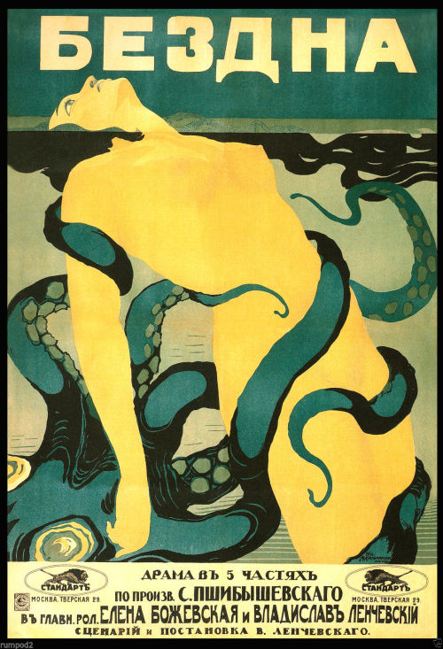
The Abyss, 1917. Russian science fiction movie poster.
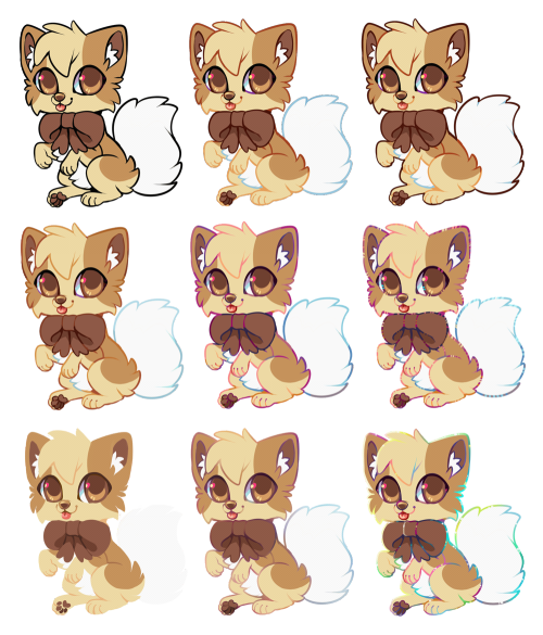
Line Coloring Styles by Kawiku
 |
| To Be Where There's Life by Ryan Coleman, oil on canvas, 30 x 40, 2010. |
The coolest thing I ever learned about painting flowers, specifically how to paint a rose, was when a painting teacher told me that you paint them by not painting them. Back then I gave her the stink eye because, really, how do I paint a rose by not painting it? Ah, humility. How you love to teach me lessons. I soooo get what my instructor was saying to me now-—and it is one of the truest art lessons I've ever learned.
Painted flowers, plants, and other organic forms seem all the more real when they are painted less literally—when you work to capture the sensation of an object but not necessarily every petal, leaf, and thorn. For example, a vase of flowers could be painted with an eye toward capturing the strong thrusting lines of the stems or the light airiness of a flower in full bloom. And that has nothing to do with the exact number of petals you paint!
 |  | |
| Memorial by Ryan Coleman, oil on canvas, 48 x 48, 2011. | Dark Fall by Ryan Coleman, oil on canvas, 48 x 48, 2007. |
Sometimes the best way to achieve these kinds of effects is with a combination of representation and abstraction. Recently, I saw artist Ryan Coleman's work and his "floral paintings"—if you can call them such—do just that. The works are not literal depictions of flowers or bouquets or groves of trees, and yet when you look at them you somehow know what they are.
Many artists throughout the centuries have incorporated both representation and abstraction in their work, from El Greco, Corot, and Pissarro to Cezanne and Picasso. In the same way, Coleman strives to depict subjects and narratives without becoming too literal, which he finds restrictive. He strikes a balance between the two, so that he feels he can work freely and expressively while the end results are paintings and drawings with hints of representation that can be very reassuring and grounding to viewers.
 |  | |
| Season of Light by Ryan Coleman, oil on canvas, 30 x 40, 2011. | Dream of Vermeer by Ryan Coleman, oil on canvas, 38 x 48, 2011. |
One of the best ways to inject your painting with sensation and liveliness that can come with combining abstraction and representation is to work from a variety of inspirations or sources. Coleman usually has an assortment of images around him when developing any given painting, from images of nature and landscapes to those from art history, interior design magazines, graffiti, cartoons, or whatever else catches his interest.
Your art would also be well served by looking at all the variety of floral paintings out there and the levels of abstraction and representation they use so you have a strong understanding of where this subject matter can take you. Debora Stewart's Abstract Art Value Pack is a perfect place to start. It covers how to achieve dynamic forms in painting, ways to experiment, strategies for gesture, color, and more. Enjoy!


