----
This Month's 15 Best Data Visual Inspirations
// Visual News
1. Film Money by DataMake
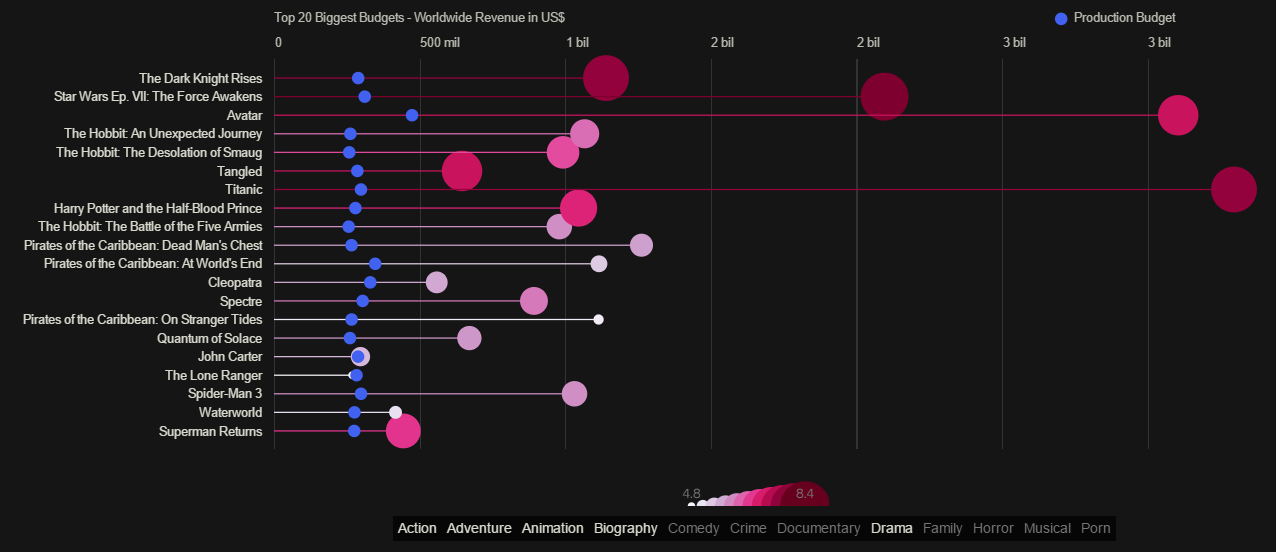
A minimalist interactive data visual that looks at what it actually takes to finance movies. As you scroll through the visual, you get an idea of how the film industry fluctuates as the visual transforms to highlight various budgetary differences.
2. What Makes a Good Visualization? by David McCandless

David McCandless, founder of Information is Beautiful, created this graphic as a visual guide of the four elements he believes are necessary for a well-crafted data visualization. This is a great tool for anyone looking to design their own data visual but is unsure of where to start.
3. On The Trump Emoto-Coaster by Periscopic
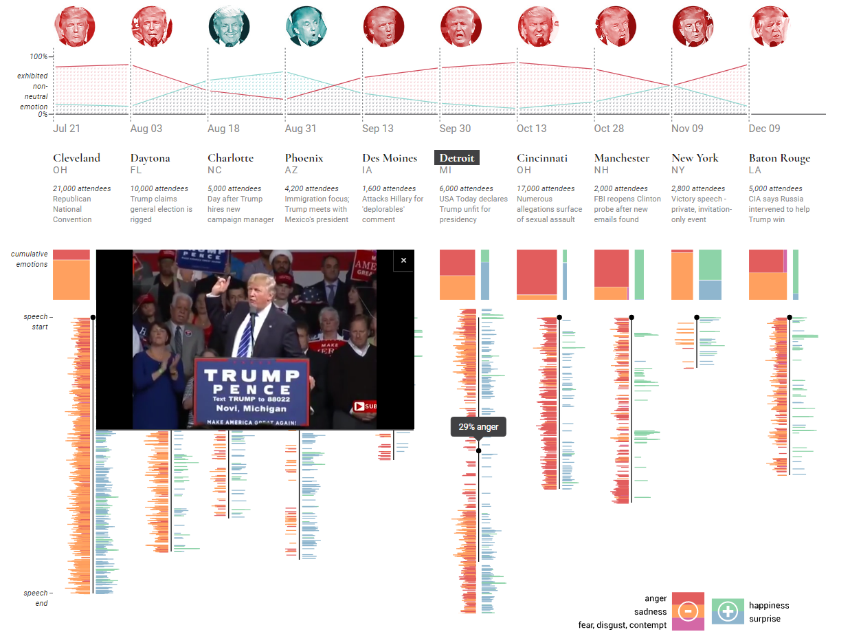
This data visual mixes interactive elements as well as video elements to create a completely immersive experience. The interactive charts reveal information as well as match video segments for each dominant emotion.
4. Literary Constellations by C82
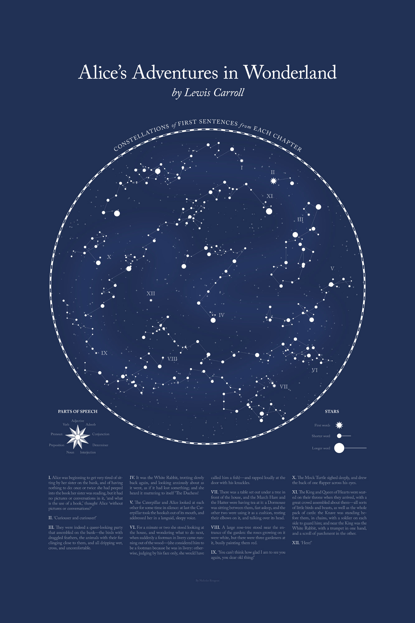
These beautiful visualizations offer a unique take on classic literary works of art, such as Dracula and Robinson Crusoe, by analyzing each book's parts of speech and first sentence from every chapter. The visuals create sections of the night sky by generating constellations out of words found in each chapter.
5. World Bank Group Education by Column Five
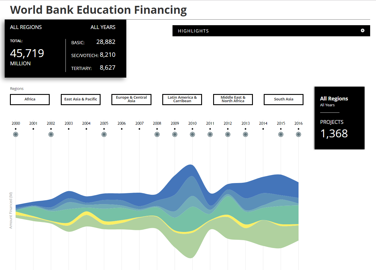
The two interactives look at different aspects of educational programs the World Bank finances. This allows users to get a broad look at the various organizations but also gives them the ability to take an in-depth look as well. This creates an uncluttered experience while still providing all the necessary information.
6. All Fights in Dragon Ball Z by Nadieh Bremer

If you're a fan of Dragon Ball Z, this comprehensive look at all of the fights that occurred throughout the 291 episodes is the perfect way to get a mental refresh of the anime. The interactive multi-colored chart is playful and perfectly presents the information in a way that isn't too overwhelming, considering how much is being delivered.
7. The Tallest Statues In The World by Marco Hernandez

This visual is not only artistically stunning, it is also highly informative and offers up some interesting facts about important statues across the globe. Available to be viewed in print version, on a desktop, or on a mobile device, the visual is well-designed and well thought out for cross-platform applications.
8. 30 Years of Oil and Gas Pipeline Accidents by CityLab
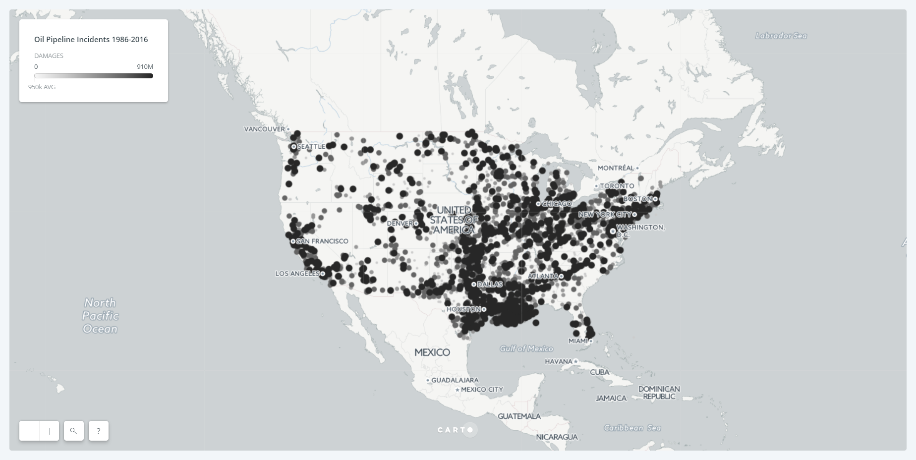
This startling visual is straightforward and uses little flare to portray the severe impact of oil and gas pipeline accidents. The simplicity of the dots amassing on the map as accidents across the country accumulate is enough to highlight the gravity of the situation.
9. One Angry Bird by Periscopic
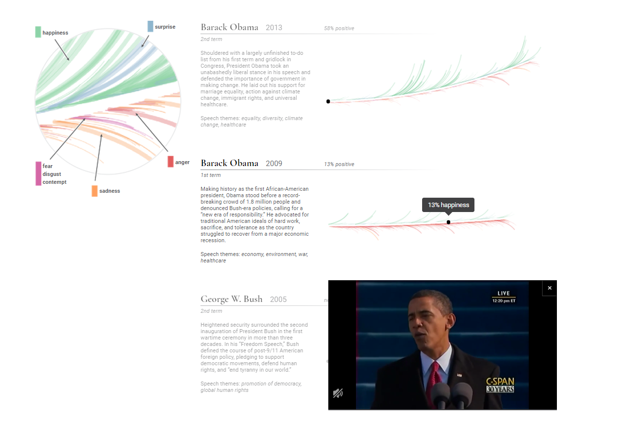
This beautiful visual beautifully interprets the emotional arcs of the past ten U.S. presidential inaugural address as multicolored feathers. Users can scroll through and quickly determine the dominant emotion president's portrayed during their speech and click on sections of the feather to view the speech in a popup video screen.
10. Baby Connect by andrew_elliot

Voted as the most beautiful data visualization of all time in Reddit's r/dataisbeautiful forum, this simple image actually represents six months of Reddit user's andrew_elliot's daughter's life in one continuous thread. The journey begins at the center of the circle (birth) then wraps outward as she ages with dark blue representing the time when she was asleep and yellow for when she was awake. A full revolution is equal to one 24-hour day making midnight the top of the clock.
11. Sierra Nevada Global-Change Observatory by Carmen Torrecillas

This visual has a lot of information on it, but the organization and neatness make it easy to navigate and understand. The thin multi-colored lines make for a beautiful system to interpret the abundant and varied bits of data.
12. What Drives A Designer? by Maga Design
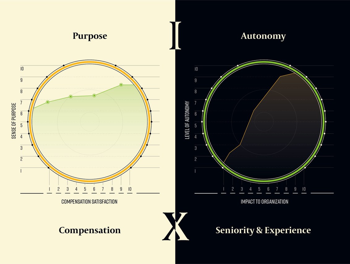
A simple and to the point set of visuals, this particular example makes use of contrasting colors to compare different details of the design industry. Users can quickly determine the two distinct aspects of the study and hone in on the relevant information.
13. Data Visualization of Trump Trends on Social Media by Affinio and TechRepublic
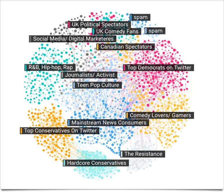
This set of graphics looks at the rising influence of social media in politics, paying particular attention to Donald Trump's campaign prior to his election. The color-coded categories and adjoining threads show how the different demographics and social groups connected in conversation over Trump's inauguration.
14. Paid Parental Leave Benefits by Column Five

This data visual perfectly separates relevant information into different blocks, creating distinct sections of related sets of data, while color continuity unifies all of the information together.
15. Death in Syria by The New York Times
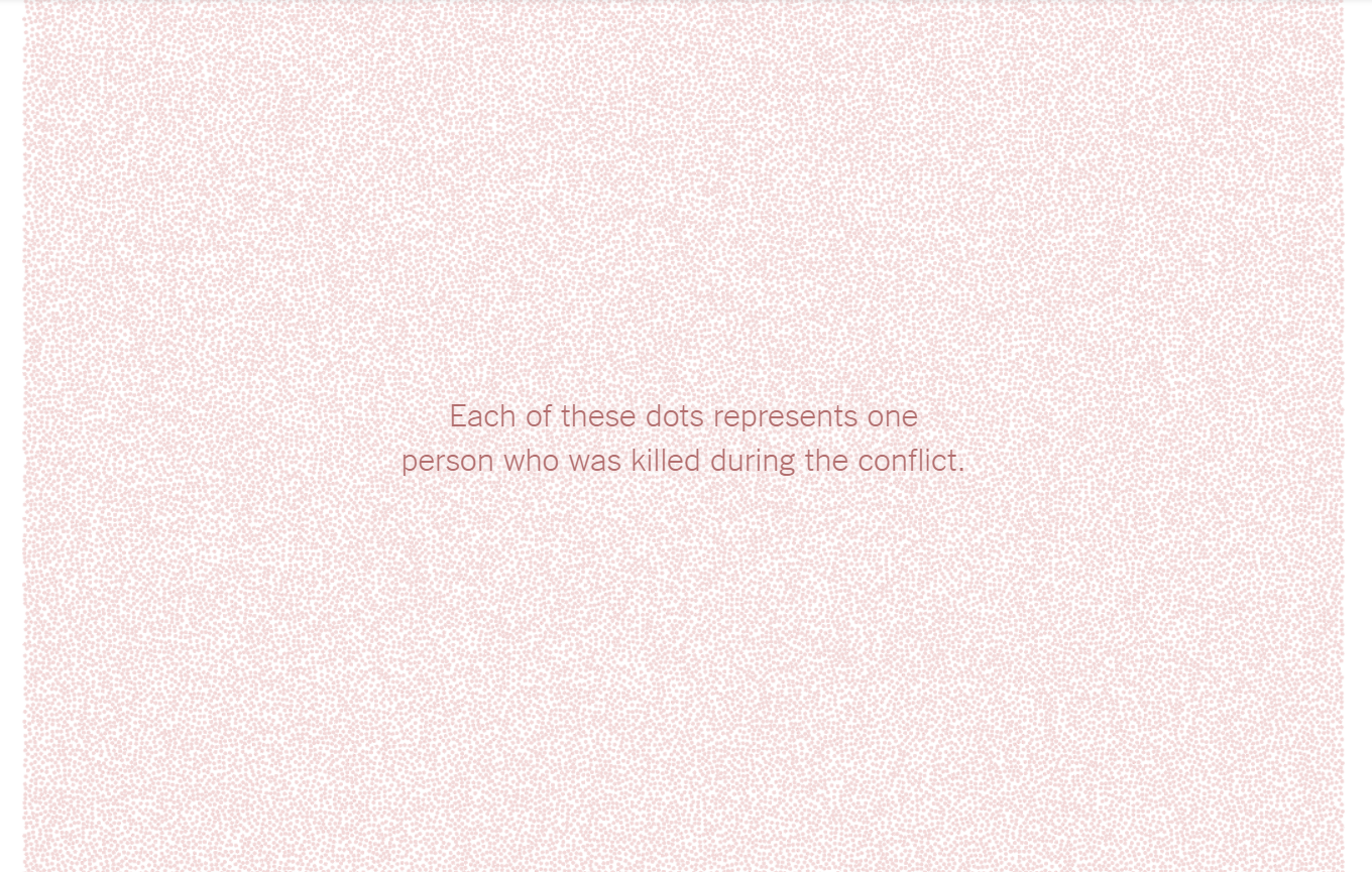
As users scroll through this visual, the thousands of dots that cover the screen paint a startling picture of the situation in Syria. It's simplicity yet effectiveness to illustrate the gravity of the situation is perfectly executed and designed, down to the color choice and large numerical font.
----
Read in my feedly
Sent from my iPhone
No comments:
Post a Comment