Tuesday, June 27, 2017

Your Art Should Feel Like Play–Not Work


----
Your Art Should Feel Like Play–Not Work
// Artist's Network

Blue Danube by Nancy Reyner, acrylic painting and gold leaf.

Blue Danube by Nancy Reyner, acrylic painting and gold leaf.

Nancy Reyner Leads an Acrylic Revolution

Sometimes we just need a little revolt. Just a little push or change to make us take nothing for granted. It's that way in art and in life. For life…I'll leave your personal revolts to you, lol. But in painting, you never want the work to feel like anything other than play. I look to Nancy Reyner to see where she leads in this regard. An accomplished acrylic artist, Nancy creates incredibly powerful paintings by playing through techniques that aren't taught in any class I've taken before. Instead, she pushes the medium and experiments with gesture and layers, and the results are kinda wondrous. You can almost feel the joy they are steeped in.

Play with Your Tools

Nancy stress that you can paint with acrylic on so many different surfaces. The same is true about the tools you paint with. Here are a few to try:

Feathers

Toothbrushes

Combs

Straws

Coins

Branches, leaves, or flowers

Hidden Rainbow by Nancy Reyner, acrylic painting.

Hidden Rainbow by Nancy Reyner, acrylic painting.

Playing with Your Surface

Nancy is also a big advocate of playing with your surface. It is your starting point and can yield a lot of inspiration. So consider staining it beforehand. An underpainting allows for subsequent layers of color to really pop. Add texture. If you are using a panel, scuff up the surface. If you are using canvas, abrade it. You can also paint on paper. Or mold that paper to a three-dimensional shape and paint a literal sculpture. Or you could crumple the paper before you start and allow the creases and folds to carry you through.

When Your Painting Is Done — Quick Tip

Acrylic has a two-part drying process. The first part, known as "dry to the touch," means the top layer of the paint skin has dried due to the evaporation of the water in the paint. The second part involves the polymer or acrylic in the paint, which takes several days to several weeks to fully cure. The actual curing time is dependent on the layer's thickness and environmental factors. During this curing time, it is important to not tightly wrap or store the artwork in a closed environment and to avoid exposing it to extreme temperatures.

Ready for the Revolution?

Nancy Reyner is an artist who, I would claim, never worked a day in her life…at least when it comes to painting. The joy and freedom of play and rule-breaking is an essential part of who she is as an artist. Let her show you the way to revolution with the video download of her Acrylic Revolution workshop. Nancy shows you how to take basic exercises like painting skies and trees and turn them into creative powerhouse moments. And right now, we are having a super sale on video downloads, where you get 2 for 1! Double up on your resources now and enjoy!

Courtney 

The post Your Art Should Feel Like Play–Not Work appeared first on Artist's Network.


----

Read in my feedly


Sent from my iPhone

Meet the Swiss duo behind graphic design agency Cécile + Roger


----
Meet the Swiss duo behind graphic design agency Cécile + Roger
// It's Nice That

Cecileroger-graphicdesign-itsnicethat-list

Cécile + Roger is a graphic design agency run by Cécile Nanjoud and Roger Gaillard. The Geneva-based duo's work moves across brand design, identity, type design, editorial design, illustration, motion and web design. We asked the Swiss designers to tell us more about themselves and their process.

Read more


----

Read in my feedly


Sent from my iPhone

Eye Candy for Today: Chardin’s The Scullery Maid


----
Eye Candy for Today: Chardin's The Scullery Maid
// lines and colors

The Scullery Maid, Jean-Siméon Chardin
The Scullery Maid, Jean-Simeon Chardin

In the collection of the National Gallery of Art, DC. Use the Zoom or Download links to the right of the image on their page.

18th century French painter Jean-Baptiste-Siméon Chardin was noted for his wonderful still life paintings (that I think magically hold time still in a way comparable to Vermeer), but he also painted a series of domestic interiors.

Some of these are as much still life as they are a room interior or genre piece. A case in point it this beautiful and deceptively simple scene of a maid washing kitchen utensils. For me, the copper pot — radiant with subtle reflected colors — steals the show, but the pottery piece and barrel are not far behind.

The figure, like those of De Hooch, seems more an object in the room than a person with whom we are meant to connect. As such, she is rendered with the same volumetric and textural presence as the other objects, defining space as well as existing in it.

I love the textural application of paint in her face and cap in particular, and in her clothing in general.

The control of edges throughout, as in all of Chardin's paintings, is remarkable. Look at the softness of the edges of the barrel hoop (images above, second from bottom), and the way the edges of the crock disappear into the floor and background (images above, bottom).


----

Read in my feedly


Sent from my iPhone

Illustrator Jill Senft creates fun and whimsy with her cavalcade of pink characters


----
Illustrator Jill Senft creates fun and whimsy with her cavalcade of pink characters
// It's Nice That

Jill-senft-hotdogs-illustration-itsnicethat-list

Berlin-based illustrator Jill Senft enjoys painting "funny faces and absurd situations" with a degree of exaggeration in every brushstroke. "Perspectives aren't always accurate in my work, which also serves as a dimension of abstraction at times," explains Jill. The illustrator's style is simple, colourful and funny and her most recent works have developed out of using acrylics as her medium. "I always wanted to try it but didn't because I was a bit stuck to my marker before, which I loved since I first started illustrating," says Jill. Using paint allows Jill to create wonderful textures within her works, animating her characters even more. "[Using acrylics] I can let colours fade into one another or mix them up as I like but most importantly: painting with acrylics gives me a feeling of freedom and independence as I can play around and overpaint existing parts at any time," she says.

Read more


----

Read in my feedly


Sent from my iPhone

Bruises Tutorial by Bunsiebox


Sent from my iPhone

Abstract Cakes Topped With Chocolate Brushstrokes


----
Abstract Cakes Topped With Chocolate Brushstrokes
// Colossal

Moscow-based bakery Kalabasa takes a more abstract view of cake decorating, mounting its confections with stiff swipes of chocolate that look like painted brushstrokes. The colorful cakes and cupcakes are each decorated with layers of the crisp painterly gestures, and often drizzled with similar colors to tie together the whole production. You can view more of the artistic treats in a variety of shades on the bakery's Instagram. (via Design You Trust)


----

Read in my feedly


Sent from my iPhone

Monday, June 26, 2017

Pigalle, Ill-Studio and Nike have redesigned the Paris Duperré basketball court


----
Pigalle, Ill-Studio and Nike have redesigned the Paris Duperré basketball court
// It's Nice That

Pigalle-ill-studio-nike-duperre-basketball-court-2017-itsnicethat

French design and photography agency Ill-Studio and fashion brand Pigalle have redesigned and repainted the Paris Duperré basketball court, with support from Nike. The court is squeezed between buildings in a Parisian suburb on Rue Duperré, and became internationally renowned in its previous guise, painted in graphical blocks of primary colours.

Read more


----

Read in my feedly


Sent from my iPhone

Cookbook Art Worth Breaking Your Diet For


----
Cookbook Art Worth Breaking Your Diet For
// Artist's Network

Cookbook art is the perfect blend of our two favorite things: food and art. What better way to kick off the start of summer than indulging our eyes and our taste buds all at the same time? Let's dig in!

365 Days of Delicious Foods — David Meldrum

cookbook art

Collage, acrylic, watercolor, pen and ink on paper, 11 7/10 x 16 1/2) by David Meldrum


We're all too familiar with the dreaded food resolution. Don't eat fun things: cake, butter, choose-your-weakness—David Meldrum's resolution was of a different nature. "One evening whilst waiting for a bowl of noodles to cool," he says, "I started drawing them. I thought, perhaps, a day's food intake would be interesting, then perhaps a month's before deciding that a year's would be really interesting and challenging!"

That's how the Food Illustrator Project was born; and at the end of it, he would land a gallery show to display each of his 365 finished works. His favorites are less associated with the food and more with the memories of the day. That being said, look out for frogs. Meldrum ate 122 Cadbury Freddo Milk Chocolates over the course of the year.


cookbook art

Acrylic, pen and ink on a paper menu, 8 1/4 x 11 7/10) by David Meldrum


A Little Still Life with Your Entree — Mollie Katzen

cookbook art

Broccoli on Chinese Silk from Still Life with Menu (pastel on paper, 9×13) by Mollie Katzen


Among the ranks of classic cookbooks, Mollie Katzen's Moosewood Cookbook is the cherry on top of a literary sundae that gives little room to vegetarians. It's been more than four decades since the book was self-published by Katzen, and still, the book reigns supreme, selling 20,000 to 30,000 copies each year, complete with her charming black-and-white illustrations and hand-lettered text to accompany the recipes.

Although her original success in Moosewood is going strong, she finds success, too, in art. "After making two black-and-white books with decorative illustrations and hand lettering in pen and ink," she says, "I wanted to expand to color and full compositions, so I could bring my love of painting into the process." What resulted was Still Life with Menu Cookbook, in which pastel vignettes, more fully formed and with bright color, accompany the menus laid out by Katzen.


cookbook art

Vegetable Heaven (pastel on paper, 18×24) by Mollie Ketzen


Olive John Burgoyne's Food Drawings (get it?)

cookbook art

Ollives, Cook's Illustrated (pen, ink and watercolor on paper, 19 1/2 x 16 1/4) by John Burgoyne


Scientific and classical, the food drawings that John Burgoyne creates highlight the ingredient itself as pure, unadulterated–the pinnacle of man's cultivation. You might recognize Borgoyne's work from the back page of Cook's Illustrated, a page he's been creatively executing for nearly two decades.

The page is typically of a single food item in its many iterations: varieties of heirloom tomatoes, types of French cheeses, even more playful food groups like hard candies. "In 1998, Amy Klee redesigned Cook's Illustrated," says Burgoyne. "Part of the redesign was to illustrate the back covers, and they brought me on board. Cook's has been so passionate about the magazine and its artistic personality." That passion has translated into 108 back covers for Borgoyne in his signature bold, academic style, and he says collectors are starting to take notice.


cookbook art

Cherry Tomatoes, Cook's Illustrated (pen, ink and watercolor on paper, 13 1/2 x 11) by John Burgoyne


We think art + food = delightful. Do you? Let us know your favorite food-inspired art in the comments below! And, be sure to watch the preview below of Capturing Light & Form: Still Life in Pastel with Alain Picard to learn how light and shadow create the form of an object, and apply those lessons to a still life of three apples on a table.


If you enjoyed this preview, head to ArtistsNetwork.tv to stream the full-length video workshop.


The post Cookbook Art Worth Breaking Your Diet For appeared first on Artist's Network.


----

Read in my feedly


Sent from my iPhone

The Color Series | 20 Artworks That Cloak Their Compositions in Blue


----
The Color Series | 20 Artworks That Cloak Their Compositions in Blue
// Brown Paper Bag

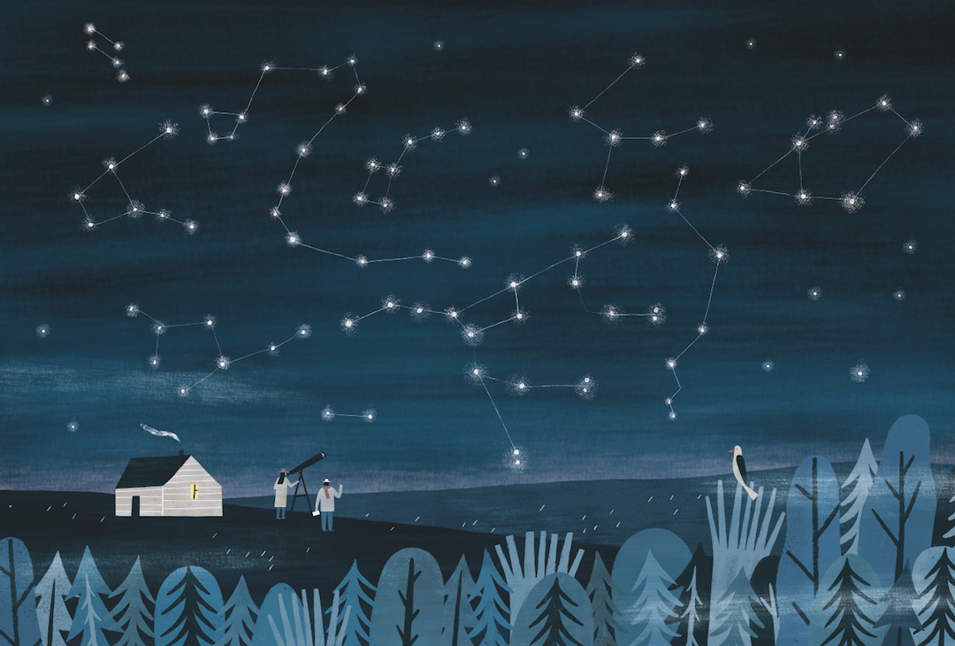
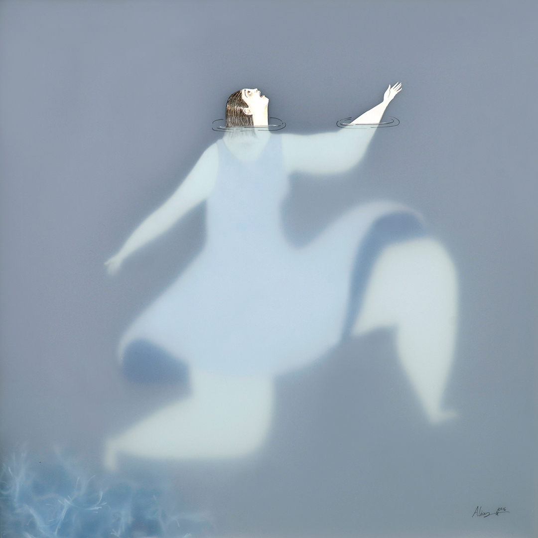
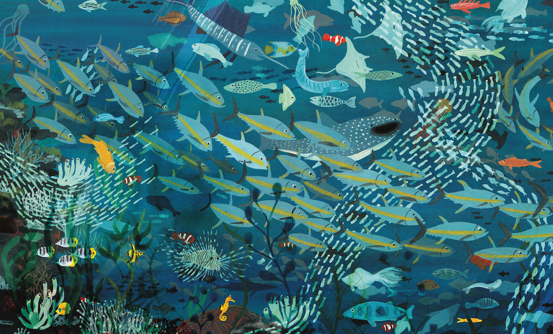
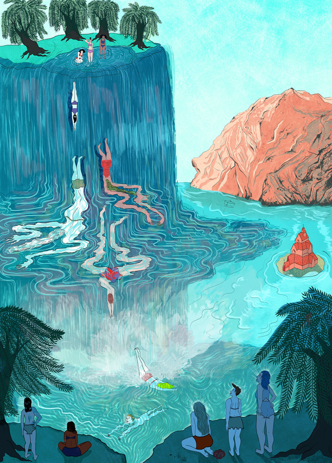
Blue illustrations

You can't understate the importance of color—especially in art. It wields its power in all sorts of ways, from setting the mood to giving us important visual clues. Over the next several weeks, I'll share a selection of illustration, paper craft, and embroidery that overwhelmingly uses one hue in its composition. Called The Color Series, first up are blue illustrations.

Blue is one of the most popular colors to use in an artwork—and it's no surprise. Conceptually, it has a lot to offer; environments are created using the hue and make it ripe with story-telling possibilities. Water, sky, and the darkness of shadows are all the product of this cool color. And, you'll see that in a lot of the work featured here. Some of it speaks to blue's melancholy side, while other pieces focus on the tranquility and calm of which it's also associated.

The color blue can be tranquil… or sad.. or even go bump in the night. Check out how 20 blue illustrations use the cool hue to create compelling visual works.

Illustration by Ana Frois

Ana Frois

Illustration by Kirsten Sims

Kirsten Sims (on Brown Paper Bag)

Illustration by Nastia Sleptsova

Nastia Sleptsova

Illustration by Gala Pont

Gala Pont

Illustration by Sonia Alins

Sonia Alins (On Brown Paper Bag)

Illustration by Maggie Chiang

Maggie Chiang (on Brown Paper Bag)

Embroidery by Slow Stitch Sophie

Slow Stitch Sophie (on Brown Paper Bag)

Embroidery by Elizabeth Pawle

Elizabeth Pawle (on Brown Paper Bag)

Illustration by Anne Laval

Anne Laval

Illustration by Marc Martin

Marc Martin (on Brown Paper Bag)

Collage by Celan Bouillet

Celan Bouillet (on Brown Paper Bag)

Illustration by Lily Padula

Lily Padula

Blue illustration by Irene Rinaldi

Irene Rinaldi (on Brown Paper Bag)

Illustration by Mouni Feddag

Mouni Feddag

Illustration by Julia Iredale

Julia Iredale

Illustration by Captain Lulo

Cheryl Teo (on Brown Paper Bag)

Illustration by Lara Hawthrone

Lara Hawthrone

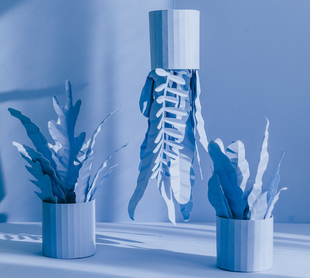
Paper craft by Raya Bujana

Raya Sader Bujana

Paper craft by José Antonio Roda

José Antonio Roda (on Brown Paper Bag)

The post The Color Series | 20 Artworks That Cloak Their Compositions in Blue appeared first on Brown Paper Bag.


----

Read in my feedly


Sent from my iPhone

Sunday, June 25, 2017

andreii-tarkovsky: By Blue Rose Print Lab


Sent from my iPhone

Paris-based Studio Jimbo creates "impact and power" with punchy poster designs


----
Paris-based Studio Jimbo creates "impact and power" with punchy poster designs
// It's Nice That

Studio-jimbo-graphic-design-itsnicethat-list

Jimbo Barbu works under the moniker Studio Jimbo, as an independent designer and art director in Paris on various editorial, branding and identity projects. "My style is communicative, using typography to create impact and power," explains Jimbo. "Science fiction, art, photography, fashion music are all inspirations and anything can make something click in my head and give me an idea."

Read more


----

Read in my feedly


Sent from my iPhone

Gurney Journey: "Fire and Ice" backgrounds

Gurney Journey: "Fire and Ice" backgrounds: Detail from Frank Frazetta's poster art for Fire and Ice, from Frazetta.net Director Robert Rodriguez announced a few days ago t...

Friday, June 23, 2017

Eye Candy for Today: Julian Alden Weir’s The Factory Village


----
Eye Candy for Today: Julian Alden Weir's The Factory Village
// lines and colors

The Factory Village,  Julian Alden Weir, American Impressionist painting
The Factory Village, Julian Alden Weir

In the collection of the Metropolitan Museum of Art. Use the "Download" or "Enlarge" links under the image on their site.

In this late 19th century scene — that makes factory life seem almost idyllic — I love Weir's textural application of paint and the way he uses it to soften his edges, particularly in the trunk and branches of the tree.


----

Read in my feedly


Sent from my iPhone

The 3 Cycles of Painting: Freedom, Faith and Healing


----
The 3 Cycles of Painting: Freedom, Faith and Healing
// Artist's Network

Best Ways to Paint in Your Studio

3 Cycles of Painting, Acrylic Painting, Nancy Reyner, Painting Process | Artists Network

Energy Field & Water by Nancy Reyner, acrylic on canvas


Someone once asked me if I go to my studio every day, or do I wait until I feel creative. This got me thinking about my art-making process. I discovered that I paint using three different cycles: beginning, continuing and completion.

Perhaps this may seem too simple. But by identifying these separate cycles I realized that each one requires a different type of energy, technique and approach. This, in turn, increased my productivity and gave an ease and flow to my studio time. In a nutshell, beginning is about freedom, continuing requires faith and completion is about healing.

I go to my studio almost every day, regardless of how I feel. But when I get to my studio, I start by taking a moment to choose the activity that best pairs with how I feel. Creativity takes on many guises.

Freedom in Beginning

3 Cycles of Painting, Acrylic Painting, Nancy Reyner, Painting Process | Artists Network


Sometimes I want to try out new things, have high levels of active energy, want to engage in something playful, or I just want to experiment. I always have lots of extra canvases and surfaces around (even a stack of cardboard will do) and I may launch several to a dozen new paintings in one day. This is my beginning cycle using freedom and play.


Faith in Continuing

3 Cycles of Painting, Acrylic Painting, Nancy Reyner, Painting Process | Artists Network


Other times I get to my studio feeling overwhelmed with too many paintings in process, or I have a less active, more meditative energy. In this case, I turn all my canvases except one to face the wall so I am not distracted and can focus on one painting at a time.

This "continuing" cycle is often the toughest for me. The work can lose its initial surprise and excitement, or hasn't yet become something cohesive, so I need to trust and have faith that by working on the painting one step at a time, one area at a time, it will start to mature.

Healing in Completion

3 Cycles of Painting, Acrylic Painting, Nancy Reyner, Painting Process | Artists Network

Hidden Rainbow by Nancy Reyner, acrylic on panel


Over the course of two months, I will usually spend at least half my studio time starting new work, in the beginning cycle. About a third of my studio time is in the continuing cycle. The remaining amount of time, perhaps only a small percentage focuses on completing work.

Finishing a painting takes a very particular type of energy. On these very valuable and rare days, I can clearly see what each painting needs to make it the best it can be. I will give that last finishing touch to several in one day—finishing them all! Then I go out and celebrate. It's more of a struggle for me to work on one painting, by itself, through all its cycles. Having many choices of paintings to work on simultaneously takes the "attachment" factor out of working on just one. In this way, I can put my energy to its best use.

When I am painting a commission with a deadline for completion, I will paint it all the way through, but I still take occasional breaks to play on some other paintings to keep the juices flowing. I find it easiest to work in one cycle for the whole day, and not switch during that day. For instance, if I spend several hours flinging paint in a freedom engaged session of "starts" I will not be as adept on that same day to try to finish a different painting.

How to 'Create Perfect Paintings'

The clip above on my three cycles of painting is pulled from a video I made which features highlights from my latest book, Create Perfect Paintings.

You can watch the entire presentation at my YouTube Channel, which includes the best ways to bring attention to your painting, extend its viewing time and heighten the viewing experience.

***

3 Cycles of Painting, Acrylic Painting, Nancy Reyner, Painting Process | Artists Network

Nancy Reyner


From creating costumes and sets for theater and film to coordinating public arts programs for the state of New York, Nancy Reyner has had an extensive career in the arts. She has been painting for more than 30 years, teaching and exhibiting both nationally and internationally.

Learn some of her painting techniques through her video workshops, streaming now at ArtistsNetwork.tv. You can also find her video and book, Create Perfect Paintings, in the North Light Shop. Happy painting, artists!

The post The 3 Cycles of Painting: Freedom, Faith and Healing appeared first on Artist's Network.


----

Read in my feedly


Sent from my iPhone

Deciphering Flesh Tones


----
Deciphering Flesh Tones
// Muddy Colors

-By Howard Lyon


Color is a fascinating and challenging part of painting.  It can be defined as hue, saturation and value. Today, I am going to focus a little more on saturation. Saturation being how intense or gray a color is.

Before I get going though, I think I need to add a disclaimer to this post. Painting from life is the best way to understand color. Also, photographs of paintings are by no means the same or close to observing a painting in person and only capture a small range of color and value discernible to the eye.


With that out of the way, I do think there are some important things we can learn about color using the computer and photography. Also, photographing paintings for later study can help to reinforce or add to observations made in person. I mention this along with the disclaimer because I am going to use a photograph of a Bouguereau painting to make some observations today.


I have long been fascinated by William Bouguereau's paintings. There are other artists whose work I admire more for their artistry and subject, but I am hard pressed to think of another artist who achieved such a high level of technical skill. He could draw with great accuracy and had a wonderful eye for value and beauty, but for me it was ability to paint skin with very subtle shifts in hue and saturation that draws me in.

When Bouguereau was at his best, the flesh in his paintings looks like there is blood flowing just under the skin, vibrant and alive. You also see so much color. There is no 'flesh color' but many slight changes in hue and saturation that work together to create the impression of flesh.


In an effort to understand color a little better, I came up with a way of examining a photo of one of his paintings. I did this a few years ago and posted it on my site, but I did a little variant this time and I think it is more useful. Again, it is full of limitations, but maybe it will further cement knowledge you have or generate some new thoughts.


What the heck is going on here!? Let me explain. I am sampling colors from the face and hair. Each number and circle on the right show where I sampled a color. On the left, in column 'C' I filled the square with the sampled color and corresponding number. Column 'B' shows each of the colors, but with all of their values more or less equalized to a middle value. Column 'A' shows the colors with their saturation levels maxed out.

For me, column 'A' is the most revealing. When the colors are all shown at full saturation, the narrow range of hues used is much more obvious. Look at row 8. That color is from the white of her eye! It is really a very gray yellow, but it isn't as clear until the color was pumped up to full saturation. It is also neat to see the progression from swatches 5 – 19, from the top of the forehead to the chin and up the neck and see the small shifts from orange to red and back to orange.


In the image above, I have arranged the same colors descending from red to yellow to show the spectrum of colors used in a clearer way. I kept the original numbers paired to the swatches. Again, we have the sampled color in column 'C', the colors almost equalized (there is a little variation) to a middle value in column 'B' and the full saturation in column 'A'. Now, column 'B' stands out to me. Look at the top three rows, where the reds are nearly the exact same hue, but vary in saturation. They appear more blue or purple, warmer and cooler mostly due to their different saturation levels (they aren't the exact same hue, but quite close). Look down the rest of column 'B'. See how the colors vibrate and pulse in and out based on their saturation? More so than the fully saturated column 'A'. The variety you can get by changing the saturation just a little is very exciting to me.


Color starts to do some interesting things as you drop out the saturation. You can achieve a sense of blue, green and purple by dropping the saturation of red, orange and yellow. It is as if grey starts to take on the properties of a compliment when placed next to a color of similar value. The gray gives your more saturated colors life that they don't posses on their own. By working the saturation, you can create the appearance of blue veins under the skin, the purple flesh some complexions have around the eyes and cheeks and the cooler tones around the mouth and jaw.


If you are curious about giving this a try, next time you are painting flesh work in a neutral gray of similar value to the color you are working with and see what happens. See if you can create the appearance of color beyond those you squeezed out of the tube. That isn't to say you should or shouldn't use a full range of colors to paint flesh, but it is a worthwhile approach and exercise to try it if you haven't.

Of course this won't make you paint like Bouguereau, but hopefully it will either remind you or help you see how wonderful gray can be in adding life to your work.

*The photographs in this post are from the Art Renewal site and the Truth in the Bright Light of Day blog.
----

Read in my feedly


Sent from my iPhone

https://instagram.com/p/BVrmRCgnYtP/

https://instagram.com/p/BVrmRCgnYtP/
--
-nate

Why didn’t great painters of the past reach the level of realism achieved today by many artists? - Quora

https://www.quora.com/Why-didn't-great-painters-of-the-past-reach-the-level-of-realism-achieved-today-by-many-artists


Sent from my iPhone

Thursday, June 22, 2017

Cut-Paper Collage Sketchbook Constructs the Charm of Small Towns


----
Cut-Paper Collage Sketchbook Constructs the Charm of Small Towns
// Brown Paper Bag

Collage sketchbook by Clover Robin

Illustrator Clover Robin is no stranger to Brown Paper Bag. I was first wowed by her last year when I found that she chronicled her travels using collage—while on the road! Since then, I've been following her work as she fills her sketchbook pages with more cut paper goodness. Clover writes that she "delights in nature and all things botanical," and is "inspired by a childhood of woodland walks and countryside rambles." As such, her illustrations often feature quaint homes and beautiful blooms that utilize a bevy of color and texture. Although they're abstract, Clover arranges the brush strokes, splatters, and colors to build form. The result is both structured with a sense of spontaneity and freedom—sort of like being outdoors.

To see what Clover is currently cutting, be sure to follow her on Instagram.  She's one of my favorite sketchbook artists to follow.

Clover Robin creates illustrations inspired by "woodland walks and countryside rambles." They give her sketchbook ideas that lead to charming collages.

Collage sketchbook by Clover Robin

Sketchbook ideas from Clover Robin

Sketchbook ideas from Clover Robin

Sketchbook ideas from Clover Robin

Collage sketchbook by Clover Robin

Collage sketchbook by Clover Robin

Collage sketchbook by Clover Robin

Collage sketchbook by Clover Robin

Collage sketchbook by Clover Robin

Collage sketchbook by Clover Robin

The post Cut-Paper Collage Sketchbook Constructs the Charm of Small Towns appeared first on Brown Paper Bag.


----

Read in my feedly


Sent from my iPhone

What Happens to an Aging Artist’s Eyes?


----
What Happens to an Aging Artist's Eyes?
// Artist Daily

Frances x 3 by Sargy Mann.
Frances x 3 by Sargy Mann, oil painting.

After a minor vision scare, we are reminded of the fragility of the eye–these complex organs which allow us to experience all the visual beauties of the world. And, we are reminded, once again, never to take our precious vision for granted. But, like the rest of the body, the eye ages with time.

If we remain free of injury or disease, our eyes may only experience slight changes as we age, but even these small changes may affect our abilities as artists to judge subtleties of color, light and dark.

An Artist's Vision, Literally

Doctors Michael Marmor and James Rabin write about the aging eye of the artist in their book, The Artist's Eyes, originally published in 2009. Their extensive credentials and lifelong interest in art give them a unique ability to analyze the effects of vision changes on some of the most famous artists throughout history.

About the aging eye, they write:  "The eye makes fewer tears; the cornea may lose some clarity; the pupil stays smaller in both light and dark; the lens becomes thicker, denser, more yellow and less elastic; and the retina loses a small percentage of its nerve cells every year  . . .  as does the brain. Thus the elderly eye receives slightly less light transmits images of slightly less clarity and color spectrum, and there are fewer retinal cells to pick up the images and code them properly for the brain."

These conditions tend to lead to less contrast discrimination and more difficulty seeing in low lighting conditions. Under low light, blues and greens can become more difficult to distinguish.

Interestingly, however, under good lighting, even a small amount of yellowing of our lenses may not affect our ability to compare colors, because "our discrimination of colors is based more on the relative amounts of red, green and blue than on absolute wavelength."

It is amazing how well the eyes perform the complex tasks of relaying visual information to our brains over our lifetimes. They are, after all, organs exposed to extensive sunlight and high oxygen, unlike our internal organs.

Monets Glasses
Monet's Glasses The two different lenses in Monet's eyeglasses (the right lens is significantly thicker) were to compensate for a cataract that had been previously removed. The thinner and hazy left lens blurred images so that they would not interfere with the vision of the artist's right eye after the surgery, according to The Artist's Eyes, Vision and the History of Art by Michael F. Marmor and James G. Ravin.

Although it may be important to be aware of the visual changes of the aging eye, we agree wholeheartedly with the doctors, who state:  "For most aging artists, these mild visual effects will be less critical than nonvisual effects of age, such as maturation of style and technique, the evolution of art historically, economic pressure to continue or discontinue a mode of painting, and technologic advances in paints and other equipment."

For inspiration on an artist who continued his work after losing his eyesight, be sure to watch the short video about oil painting artist Sargy Mann (1937 – 2015) below.

And, if you are intrigued to learn more, check out the longer video below for more about this amazing artist who handled his disability with great grace. We are confident you will find it worth your while!

This video on Sargy Mann from Peter Mann Pictures first appeared on Vimeo.

Join us on The Artist's Road for more enlightening articles, interviews with top artists, step-by-step painting demonstrations and discounts in the unique Artist's Road Store.

–John and Ann

Save

The post What Happens to an Aging Artist's Eyes? appeared first on ArtistDaily.


----

Read in my feedly


Sent from my iPhone