Eileen Goodman is painter well known over her long career here in Philadelphia for her naturalistic watercolors of fruit, flowers and gardens.
Whet's not obvious in images of her work is that she often works at a somewhat larger scale than is usually associated with watercolors, sometimes 4×3 ft (122x92cm) or larger.
Goodman explores the subtle cast of light on her subjects, often keeping her colors subdued in favor of studying delicate value changes.
I can't find a dedicated website for her work, but she is represented by the Gross McCleaf Gallery.
There is a nicely done short video by John Thornton about Godman's work and inspiration, with close-ups of her paintings, on YouTube.
With clashing fluoro colours and bold line work, Nadine Kolodziey's images are a beguiling blend of in-yer-face hues and nuanced mastery of her media. Nadine is based in Berlin and Offenbach, and has produced a glorious portfolio of graphic design and illustration in her burgeoning career. The project we're focussing on today though is Salto magazine, now in its second issue. According to Nadine, the mag sees "fragments of daily life and stories layered in a colourful mix of shapes." It looks superb – if only daily life were really so bold and cheerful.
Queen of Demons Book cover 1997 Guest appearances by Dorian Vallejo, Steve Ellis, Steve Youll and myself.
I find that other visual artists make for some of the best figurative models as they are consciously aware of the shapes their bodies make. They also have an idea what another artist may be seeking in their posing and take directions extremely well:
Tilt your head a little to the left,
Bend your right elbow and keep the hand at the same level,
Show me more of your back, break your wrist, etc....
The paintings below offer a broad sampling of artists and friends I have used over the course of my career as models for commercial commissions. These are not portraits of my friends but rather their likenesses are used in the service of my narrative work. Considering no one has 'seen' these characters before, models used to interpret characters within these narratives are all strangers to my audience. Therefore I find it fun and a challenge to capture the likeness of each of my friends as a tribute to their help in advancing the quality of my work.
As I know I am not alone in this venture, do you have any like images of artists to share??
Journey to the Center of the Earth, 1993 Michael Mrak model (and roommate at the time) and now Design Director at Scientific American
Psychohistorical Crisis, book cover, artist Dan Dos Santos (posing twice) and Carey Johnson (my wife) as models, 1999
Saint Crispin's Day - Right panel for the Battle of Agincourt triptych 2007
Red Sonya - Lover's Quarrel artist Kelley Hensing model 2011
The Night's Watch , artist Tony DiTerlizzi, writer George R.R. Martin and a host of others as players in a Game of Thrones , 2014
Fortune and Fate , book cover, artist Kristina Carroll model , 2007
Alien Crimes, book cover, artists Owen Weber,Rebecca Solow and Scott Murphy models, 2007
Reader and Raelynx, book cover, artist Scott Murphy model, 2007
Cartographer from Magic: The Gathering artist Claudia Rodriguez model 1999
Joan of Arc - On the Field art director Irene Gallo model 2010
This is another of Alma-Tadema's stunning evocations of life in classical Italy, in this case, a festival in Pompeii prior to the eruption of Vesuvius. The enlarged versions show Alma-Tadema's technique, more textural and painterly than one might assume.
ALma-Tadema painted two versions of the painting at the same time, a larger one, now in the Kunsthalle Hamburg (image on Wikimedia Commons) was placed on display; and this one was used by engraver Auguste-Thomas-Marie Blanchard to create a popular engraving.
Experimenting with plain shapes and shadows is illustrator and designer Richard Keeling, in his series of experimental posters. Richard was previously head of creative for All Star Lanes, the London-based chain of American-style bowling alleys. Finding his feet as a freelancer, Shadows Shapes is just one of many self-initiated projects the creative is working on to find his style and interests. Simple and playfully put together, these compositions are full of delicious-looking colours and feel as though I'm walking through an abstract version of the Sesame Street pinball countdown.
The file on Wikimedia, though originally from the Sotheby's sale to the museum in 2012, seems over-saturated in reds. Not having had the pleasure of seeing the original, I've adjusted a copy of that file to bring it more in line with the color on the museum's site.
Arnold Böcklin is an artist whose best known painting, Isle of the Dead, is so famous it makes him seem a one-hit-wonder, and his other work is often overlooked. Here he takes on a mythical scene, but his heart is obviously in his love of dramatic rocky landscape.
The figure of Polyphemus, the giant son of Poseidon as portrayed in Homer's Odyssey, is rendered in a sketchy, gestural forms almost as textural as the rocks on which he stands. His face is essentially a blur of madness and motion.
The rocks themselves, however, are painted in wonderful lavish detail, rich with subtle variations of color and texture, as is the sea and foam that washes around them .
Glass is a traditional artist's best friend. Literally, every single surface in my studio is covered with glass.
Many of you have probably seen, or even use, a glass palette for mixing paint. A lot of people don't realize that you can't scratch glass with a razor blade, which makes it a great surface for mixing paint! You can easily scrape the old, dried paint off of it with a simple scraper. Whereas, if you forget to wipe down a traditional wood palette, and your paint dries on it, you may as well throw it away and buy yourself a new one.
The other cool thing about using a glass palette is that you can place any image you want BEHIND the glass. I tend to keep a neutral grey surface and a value scale there for reference, but you could just as easily place a classic Bouguereau painting and try to match the colors right on top of it!
In addition to making a great palette, the scratch resistance of glass means you can also use it as a cutting surface. Though, blades do admittedly dull quickly when cutting on it, the trade off of having a large sturdy cutting surface is well worth it.
By covering every surface I have in glass, it means I can work literally ANYWHERE in the studio. Every single surface can quickly become an impromptu cutting mat, palette, easel, gessoing table, or whatever whenever I need it. All without a single worry of damaging the surface beneath. This means I can work quickly, and MESSILY, without stopping to worry about protecting things around me. Tape, turpentine, cuts, spills, food, coffee mugs, dirty brushes... none of it matters. Everything can be scraped off later on.
And best of all, it allows you to showcase the furniture beneath it. As a hobbyist wood worker, I love being able to see the beauty of oak furniture, while still protecting it from harm.
If you're looking to do this to your studio as well, there a few things to keep in mind.
Cost: Glass is relatively inexpensive, but varies according to type of glass you're purchasing. You can expect to cover a large 30x40 work surface for about $50 with the type of glass I use, which is about $3 a square foot.
Glass type: Most commercial applications of glass use what is called 'Tempered Glass'. Tempered Glass shatters into a million little pieces when it breaks, which prevents you from severing an artery on a large shard. And although this is great for windshields and coffee tables, you do not want to use it in your studio. Because the glass is covering a solid surface, there is little risk of falling through it and getting harmed.
What you want, is 'Plate Glass'. Plate glass will crack into large manageable pieces if something should go wrong. If you get a little over zealous with a clamp light or something, you might crack a corner off your glass, whereas tempered glass will explode right before your eyes and render the entire piece unusable. Tempered Glass is often called 'Safety Glass', and Plate Glass is often called 'Untempered'.
Thickness: I like to use 1/4 inch glass. Any thinner, and you run the risk of cracking it very easily. Any thicker, and you're adding a substantial, and unnecessary, amount of weight to your furniture.
Edges: Glass edges are really sharp. They need to be polished. Many glass cutters will provide a basic, flat polish free of charge. But they may not, so be sure to take polishing into account when getting a quote. Many cutters will just polish the edge to the point of not being dangerous, and stop there. But because I spend so much time working in the studio, and am often leaning my arms against the edge of the table for long periods of time, I specifically request a really deep flat polish or what is called a 'Pencil Ground' edge. The pencil ground edge simply rounds out the whole side, though can be quite costly. In most cases, a good flat polish will suffice.
Where to get it: I highly recommend finding a local provider for your glass. Although you can easily purchase it online at a discount, in my experience it is well worth the extra expense to go meet with an expert in person. My glass cutter was able to answer all of my questions, make recommendations, remembers the way I like it polished when I purchase new pieces, and has even given me great discounts on small pieces that served him little commercial purpose otherwise. ----
The PaintBerri team is excited to officially announce that the site is now in open beta! During our 4 month closed beta, we added a ton of new features and fixes, including a lite painter for older computers & mobile devices, fun games for socializing, and a block feature for avoiding drama and having a nicer time!
PaintBerri is a free oekaki-style social art site where users communicate via drawings created on the spot with the built-in browser painter.
The Full Painter: This painter is packed full of features including pen pressure support, a highly customizable brush, and hotkeys!
The Lite Painter: This simple painter is usable on mobile devices! Draw on the go from your phone or tablet, and then finish up your piece at home with the Full Painter!
Games: Art games are a fun thing to do when hanging out with artist buds - now you can play them online, too! PaintBerri's first game "MixUp" allows you and two other users to create a fun and weird creature together by blindly drawing the top, middle, and bottom sections separately before releasing your fused monstrosity on the world!
"However meaningless and vain, however dead life appears, the man of faith, of energy, of warmth … steps in and does something."
During our recent conversation at the Boston Book Festival, the wise and wonderful Amanda Palmer spoke about the harrowing experience of watching her best friend die and reflected: "Everyone in this room is going to be gone pretty quickly — and we will have either made something or not made something. The artists that inspire me are the ones that I look at and go, 'Oh my god — you didn't have to go there. It would'v been safer not to — but, for whatever reason, you did.' And every time death happens, I'm reminded that it's stupid to be safe… Usually, whatever that is — wherever you don't want to go, whatever that risk is, wherever the unsafe place is — that really is the gift that you have to give."
As the words poured out of Amanda's mouth, I saw a kindred hand reach across space and time to catch them. A century and a half earlier, Vincent van Gogh (March 30, 1853–July 29, 1890) had articulated the same sentiment in a beautiful letter to his brother Theo, found in Ever Yours: The Essential Letters (public library) — the same treasure trove that gave us the beloved artist on talking vs. doing and the story of how he found his purpose.
'Self-Portrait with Straw Hat' by Vincent van Gogh
In a particularly impassioned letter to Theo from October 2, 1884, Van Gogh writes:
If one wants to be active, one mustn't be afraid to do something wrong sometimes, not afraid to lapse into some mistakes. To be good — many people think that they'll achieve it by doing no harm — and that's a lie… That leads to stagnation, to mediocrity. Just slap something on it when you see a blank canvas staring at you with a sort of imbecility.
You don't know how paralyzing it is, that stare from a blank canvas that says to the painter you can't do anything. The canvas has an idiotic stare, and mesmerizes some painters so that they turn into idiots themselves.
Many painters are afraid of the blank canvas, but the blank canvas IS AFRAID of the truly passionate painter who dares — and who has once broken the spell of "you can't."
Life itself likewise always turns towards one an infinitely meaningless, discouraging, dispiriting blank side on which there is nothing, any more than on a blank canvas.
But however meaningless and vain, however dead life appears, the man of faith, of energy, of warmth, and who knows something, doesn't let himself be fobbed off like that. He steps in and does something, and hangs on to that, in short, breaks, "violates"…
Bringing you (ad-free) Brain Pickings takes me hundreds of hours each month. If you find any joy and stimulation here, please consider becoming a Supporting Member with a recurring monthly donation of your choosing, between a cup of tea and a good dinner.
newsletter
Brain Pickings has a free weekly newsletter. It comes out on Sundays and offers the week's most unmissable reads. Here's what to expect. Like? Sign up.
Ross Tran is a concept artist and illustrator based in Southern California. He studied at the Art Center College of Design, and his credits include work for Walt Disney Studios, Psyop and Tyler West Studio.
Tran's lively, energetic digital painting technique combines areas of detail with passages that are gesturally suggested.
In addition to the professional work on his website and blog, there are a number of personal pieces, many of which were done for tutorials. His YouTube channel contains a number of short instructional videos, also available on his blog.
A number of his images are reproduced as prints, available from InPrint.
John Bauer was a Swedish illustrator and painter, active around the turn of the 20th century, who I first wrote about back in 2006.
Since then, I'm happy to report, resources for images of his charming, wonderfully realized illustrations have become more widely available.
Though not as well known outside of Sweden as some of his Golden Age English, French and American contemporaries, Bauer was an influential and much beloved illustrator, known primarily for his fantasy illustrations for the popular Swedish fairy tale annual, Bland Tomtar och Troll (Among Elves and Trolls).
Bauer combined a delightful, personal drawing style with renderings in muted, textural watercolor. Though his trademark trolls — which influenced both contemporary and generations of subsequent illustrators — were portrayed with a dose of humor, his forest landscapes were dark and open to suggestion, leaving much to the imagination of the reader as to who or what might lurk in the receding darkness.
I particularly love his stylized tree forms, the way he used reflections in dark water, and the magical glowing light effect he achieved for his princesses by using contrast against his dark backgrounds.
Bauer was particularly influential on his successor at Bland Tomtar och Troll, Gustaf Tenggren, who is actually better known here in the U.S.
The new issue of International Artist magazine (#106, December/January) has a four-page feature that I wrote on extreme limited palettes—palettes that have four or fewer colors plus white.
One rhetorical question I pose is: Why limit your palette?
1. Paintings from limited palettes are automatically harmonious, but they're very often eye-catching and memorable too.
2. Old masters used limited palettes by default because they just couldn't get the range of pigments we have now. Using older, quieter colors can give a much wanted mellowness.
3. A limited palette forces you out of color-mixing habits. If you don't have that standard "grass green" color, you'll have to mix it from scratch, and you're more likely to get the right green that way.
4. Limited palettes are compact, portable, and sufficient for almost any subject. In fact you can paint almost anything in nature with just four or five colors.
In case you missed it, here's a recent video showing a painting made with just two colors plus white (Link to YouTube video):
International Artist magazine has been successfully using the cross-media strategy of printing QR codes next to paintings for which there is an accompanying YouTube video.
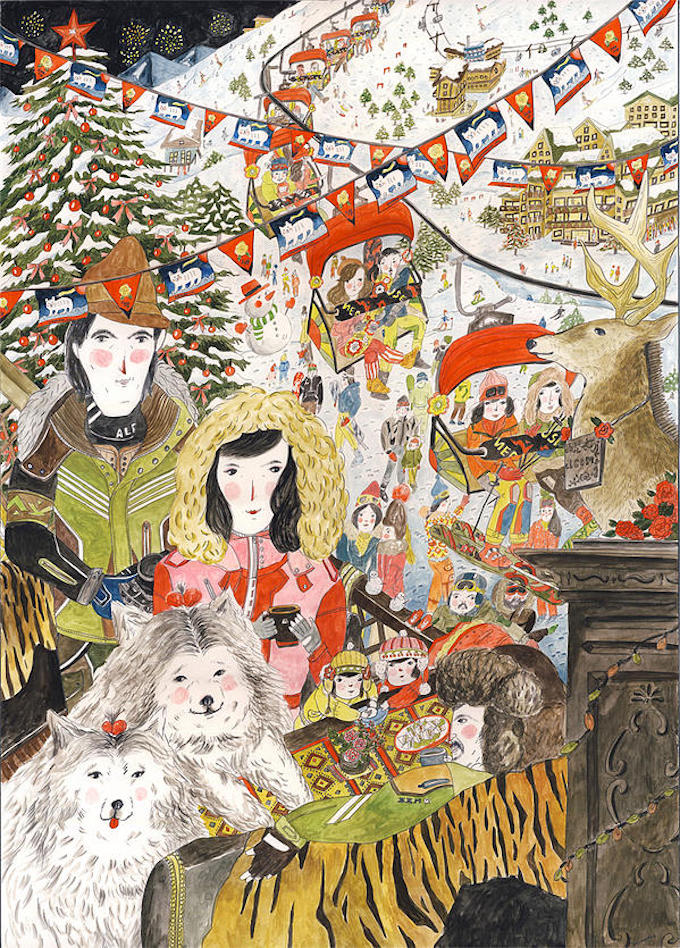
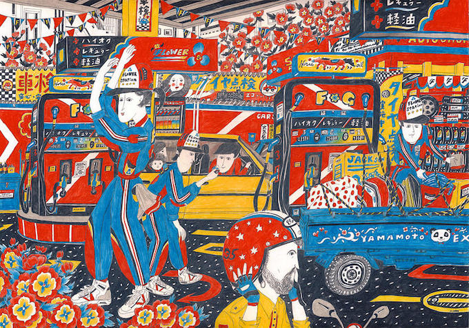
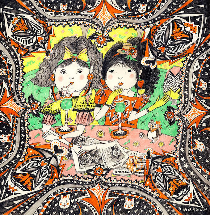
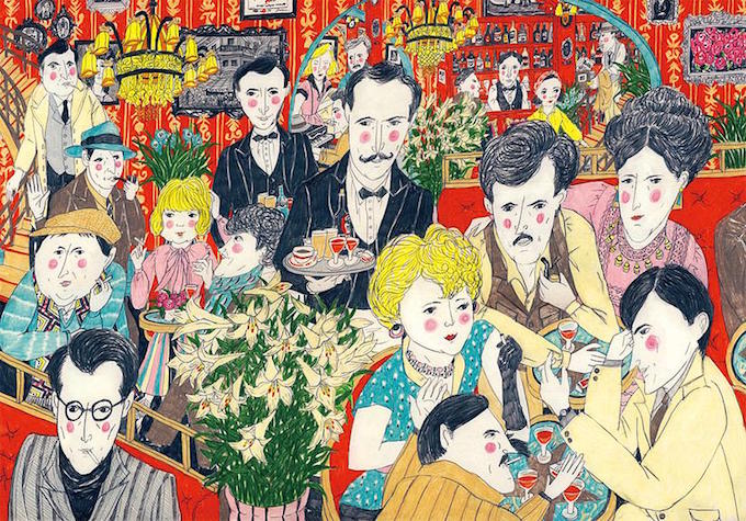
I know it's not exactly winter, but doesn't this illustration by Natsu Wakabayashi put you in the mood? Snow, skiing, hot chocolate…doesn't sound so bad! This was the first image I saw by the Japanese illustrator, but it's not the last. Natsu's enthralling portfolio is full of busy scenes that are fascinating in the amount of detail. Using pen and colored pencil, she draws tiny patterns, architectural details, lettering on sinage. It's impressive—make sure you spend time really looking at each piece. You won't be disappointed.


 During our recent conversation at the Boston Book Festival, the wise and wonderful Amanda Palmer spoke about the harrowing experience of watching her best friend die and reflected: "Everyone in this room is going to be gone pretty quickly — and we will have either made something or not made something. The artists that inspire me are the ones that I look at and go, 'Oh my god — you didn't have to go there. It would'v been safer not to — but, for whatever reason, you did.' And every time death happens, I'm reminded that it's stupid to be safe… Usually, whatever that is — wherever you don't want to go, whatever that risk is, wherever the unsafe place is — that really is the gift that you have to give."


