Thursday, February 13, 2014

Eye Candy for Today: Monet’s Parc Monceau [feedly]


Eye Candy for Today: Monet's Parc Monceau
// lines and colors :: a blog about drawing, painting, illustration, comics, concept art and other visual arts

Le Parc Monceau
Landscape: The Parc Monceau, Claude Monet. In the Metropolitan Museum of Art.

Just a little reminder from Monet that spring will indeed be back — at some point.


----
Shared via my feedly reader


Sent from my iPad

Thursday, February 6, 2014

ARTIST OF THE DAY - SIMON STÃ…LENHAG [feedly]


ARTIST OF THE DAY - SIMON STÃ…LENHAG
// PROTEUS MAG
See more at - www.simonstalenhag.se


----
Shared via my feedly reader


Sent from my iPad

Wednesday, February 5, 2014

The Best Advice [feedly]


The Best Advice
// The Oil Painting Blog

Joe Paquet (see our Voices of Experience interview for Members) reminded us of this profound quote from poet Rainer Maria Rilke:  "If your environment seems poor, blame yourself. Tell yourself you are not poet enough to call forth its richness." Paquet credits Rilke's quote with helping him to understand that he did not necessarily need to travel the world to find inspiration, but that he needed to fine-tune his sensitivity and see the inspiration that was always around him.

Baking the Bread by Anders Zorn, oil painting, 1889.

Hearing the quote again inspired us to re-read Rilke's Letters to a Young Poet. The ten letters were written by Rilke between 1903 and 1908 to aspiring poet, Franz Xaver Kappus and offer insights just as applicable to the visual artist. Exhibitions, competitions and organizations all have their places in the world of art, but they are subject to the changing winds of popular tastes and so are not the measure of an artist's work. To look to others for approval and estimation about how to paint can be an invitation to needless suffering and self-doubt. Rilke's words are reminder to all of us to make a commitment to our work not based on outward approval, but to find our inspiration in Nature and in our everyday lives.  

In the excerpts below, simply substitute the word "paintings" for "poems" and this advice applies equally to artists as well.

"You ask if your verses are good. You ask me. You have previously asked others. You send them to journals. You compare them with other poems, and you are troubled when certain editors reject your efforts. Now (as you have permitted me to advise you) I beg you to give all that up. You are looking outwards, and of all things that is what you must now not do. Nobody can advise and help you, nobody. There is only one single means. Go inside yourself. Discover the motive that bids you write; examine whether it sends its roots down to the deepest places of your heart, confess to yourself whether you would have to die if writing were denied you. This before all: ask yourself in the quietest hour of your night: must I write? Dig down into yourself for a deep answer. And if this should be in the affirmative, if you may meet this solemn question with a strong and simple "I must", then build your life according to this necessity; your life must, right to its most unimportant and insignificant hour, become a token and a witness of this impulse. Then draw near to Nature. Then try, as if you were one of the first men, to say what you see and experience and love and lose. . . ."

"Turn therefore from the common themes to those which your own everyday life affords; depict your sorrows and desires, your passing thoughts and belief in some kind of beauty - depict all that with heartfelt, quiet, humble sincerity and use to express yourself the things that surround you, the images of your dreams and the objects of your memory. If your everyday life seems poor to you, do not accuse it; accuse yourself, tell yourself you are not poet enough to summon up its riches; since for the creator there is no poverty and no poor or unimportant place. . . ."

"And if from this turning inwards, from this sinking into your private world, there come verses, you will not think to ask anyone whether they are good verses. You will not attempt, either, to interest the journals in these works:  for you will see in them your own dear genuine possession, a portion and a voice of your life. A work of art is good if it has grown out of necessity. In this manner of its origin lies its true estimate:  there is no other."

Join us on The Artist's Road for more inspiring and thoughtful articles.

--John and Ann


----
Shared via my feedly reader


Sent from my iPad

Monday, February 3, 2014

The Lost Art of Bruce Pennington [feedly]


The Lost Art of Bruce Pennington
// Black Gate
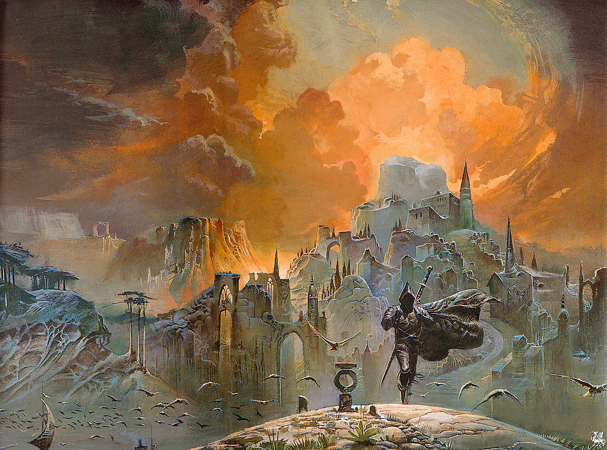
Bruce Pennington The Shadow of the Torturer-small

A few weeks ago, while discussing the cover of the Panther edition of Fritz Leiber's Night Monsters, I mentioned that I'm a huge Bruce Pennington fan. Bruce was very kind to me when I called him out of the blue in 2007, hoping to buy the rights to two of his paintings to use as covers for Black Gate. Once he'd had a chance to see the magazine for himself, and determined that I was simply a fan with a very limited budget, Bruce was extraordinarily gracious, agreeing to my modest offer without a murmur of complaint, and inviting me to look through his vast portfolio and select the covers I wanted.

Well, this was like being a kid in a candy store. I already knew that I wanted to use his extraordinary painting of an armored horseman, one of the finest pieces of sword & sorcery art I'd ever seen. It was originally published on the Panther edition of Lin Carter's anthology Flashing Swords 2.

[Click on any of the images in this article for larger versions.]

Flashing Swords 2

It eventually appeared as the cover of Black Gate 12.
Paper Tiger Miniatures Bruce PenningtonWhen you're looking for cover art, you always want something that communicates the aesthetics and tone of your magazine, and this cover captured the spirit of Black Gate better than anything else I'd seen. To this day, I still consider it our most perfect cover.

But we'd negotiated for the use of two images… what to use as the second painting?

To help me decide, I immediately ordered a few of Bruce's art books — including the delightfully compact Paper Tiger Miniature Bruce Pennington (left), which proved to be surprisingly useful. (Sixteen pages from the book have been scanned for Bruce's website; check them out here.)

It was an agonizing search. If you're at all aware of the breadth of Bruce Pennington's catalog, you'll understand that narrowing the search was enormously challenging. I could rule out his most recognizable work, of course, as well as images that were overtly horror, or didn't suit the contents of Black Gate.

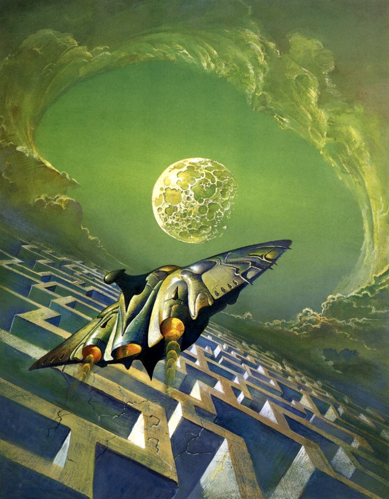
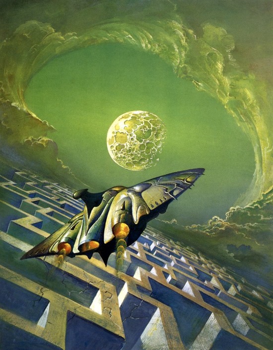
Even so, that left a lot to choose from. For example, I was sorely tempted by his cover for the British edition of Robert Silverberg's The Man in the Maze.
The Man in the Maze Bruce Pennington-small

But ultimately, I thought it was a little too science fiction in tone.

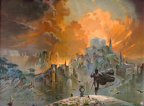
I finally settled on a series that Bruce had painted for the British editions of Gene Wolfe's Book of the New Sun, starting with the cover of Shadow of the Torturer, which you can see at the top of this article. These images were gorgeous and mysterious, perfectly suited for use as magazine covers, and as far as I could determine they had never been published in the United States.

Of course, this is where practical considerations threw a wrench into things. The moment I told Bruce about my choices, he said the horseman would be easy — he had a high-res negative he could send me immediately. But he no longer had copies of the Wolfe covers. And unfortunately, he no longer owned the original paintings, so he wasn't sure when he could get them.

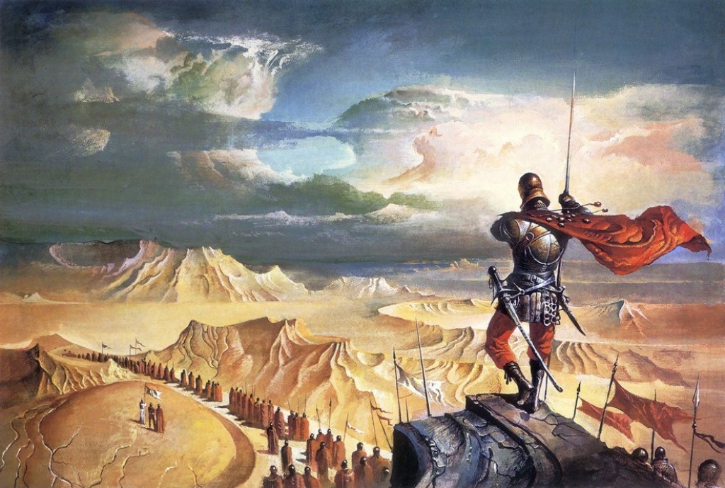
This was unfortunate. I was on a schedule, so I couldn't wait to see if the images would turn up. Instead, I moved on to my second choice, a vivid and colorful desertscape originally used as part of Frank Herbert's Dune series.
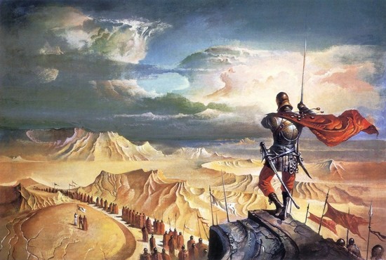
Bruce Pennington Dune-small

I was completely happy with my choice, and it eventually appeared as the wraparound cover to our first double issue, Black Gate 14.

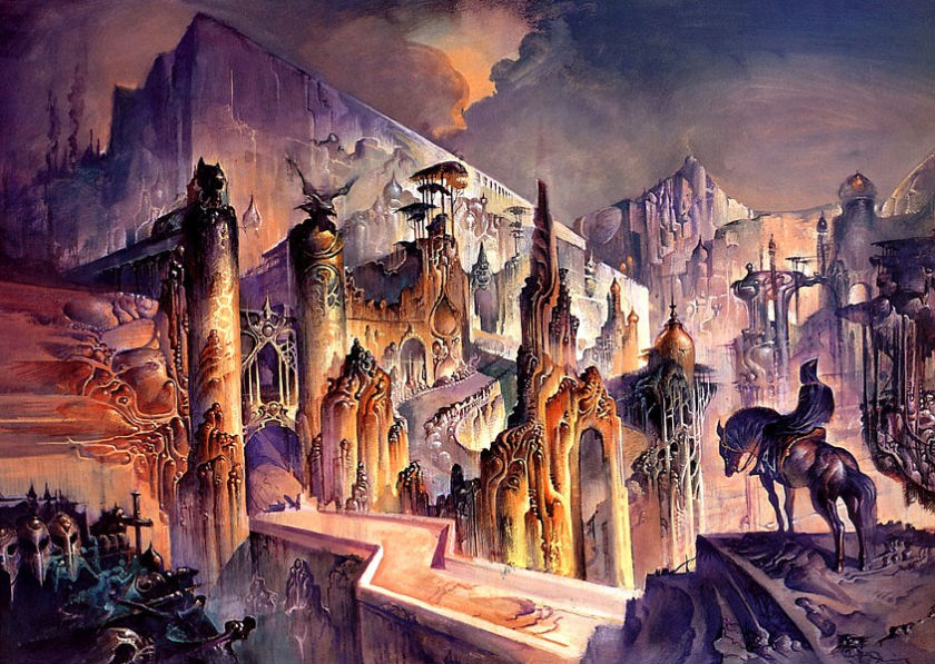
Of course, I always wondered how things would have turned out if we'd used different images. Here's a look at some of the covers I would have loved to have used for future issues of the print version of Black Gate, starting with the gorgeous cover of the British version of Gene Wolfe's The Citadel of the Autarch.
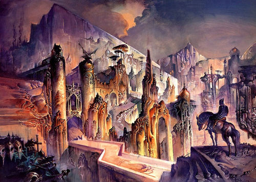
The Citadel by Bruce Pennington-small

And the cover for Claw of the Conciliator.
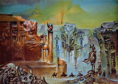
Bruce Pennington Claw of the Conciliator-small

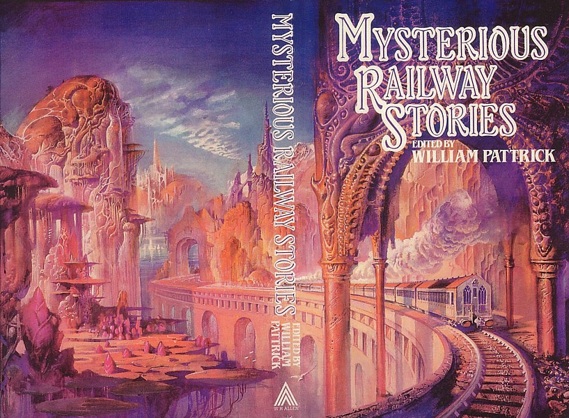
And one that I thought would have made a quirky but eye-catching choice, the cover to Mysterious Railway Stories:
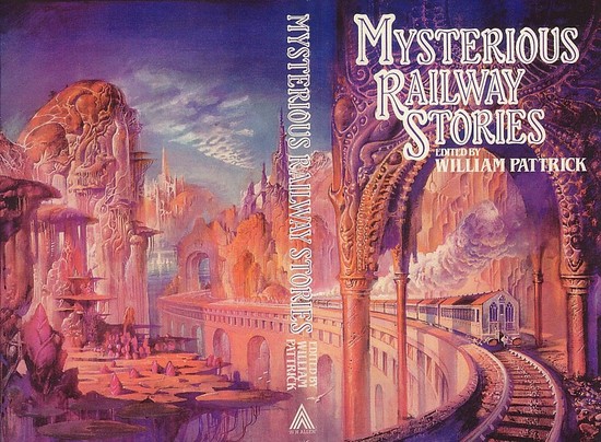
Mysterious Railway Stories-small

Of course, none of this is truly "Lost Art," as it has been published in the UK (if not in the US). But it's lost in the sense that it will never grace the cover of an issue of Black Gate. So enjoy what might have been.

Finally, I wanted to point you toward Bruce's brand new website, launched in conjunction with an exhibition held in Autumn 2013, when he was a guest of honor at the World Fantasy Convention in Brighton. There's a generous sampling of his art here, and the webmaster, Nigel Suckling, even reprinted the cover of Black Gate 12 as part of a montage highlighting how popular that image has become. Here's Nigel:

Sometimes a particular book-cover painting has several reincarnations through different publishers throughout the world, earning the artist more royalties in the form of second rights. The Armoured Horseman shown below is a typical example. Originally produced by Pennington for a British publisher as the cover of a collection of Sword & Sorcery stories, it was later used by Dutch and other publishers in the same standard paperback format.

More recently (2008) it was reproduced in the United States on a larger scale as the cover of a luxury 'coffee table' anthology devoted to supernatural fiction.

More recently still in June 2009 the same picture appeared on the cover of Fantasy Art magazine published in Beijing, the first and foremost forum for both western and eastern fantasy art in China.

Here's the montage:
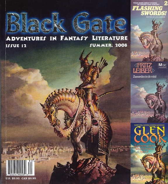
Bruce Pennington montage

I appreciate Black Gate being called "a luxury 'coffee table' anthology," although we still humbly suggest the term "magazine."

Check out Bruce's new website here.


----
Shared via my feedly reader


Sent from my iPad

The Inscrutable Eye: Sargent watercolors at Isabella Stewart Gardner Museum [feedly]


The Inscrutable Eye: Sargent watercolors at Isabella Stewart Gardner Museum
// lines and colors :: a blog about drawing, painting, illustration, comics, concept art and other visual arts

The Inscrutable Eye:<br />  Watercolors by John Singer Sargent in Isabella Stewart Gardner's Collection
For those in the Boston area who missed the show of Sargent Watercolors at the Museum of Fine Art, (which I mentioned here on Lines and Colors when the show was at the Brooklyn Museum), there are 8 other Sargent watercolors on display in Boston as part of a small exhibition: The Inscrutable Eye:Watercolors by John Singer Sargent in Isabella Stewart Gardner's Collection until February 10, 2014.

For those of us not able to get there in person, the museum has made them available online in large full-screen zoomable versions.

You need to take two steps, though: click on the works in the list on the exhibition page (from which you can also click on works in the slideshow for slightly larger versions) to the information page for the individual painting. From the individual page, click on "View in Explore" to access the large image (takes a few seconds to load). You can then close the text column, and use the fullscreen and zoom controls at upper right.


----
Shared via my feedly reader


Sent from my iPad

Sunday, February 2, 2014

A few highlights from the 1660s [feedly]


A few highlights from the 1660s
// lines and colors :: a blog about drawing, painting, illustration, comics, concept art and other visual arts

1660s painting: Gerard Dou, Johannes Vermeer, Adriaen van Ostrade, Caesar van Everdingen, Ludolf Bakhuizen, Willem Kalf, Rembrandt van Rijn, Cornelis de Man, Edwaert Collier, Gabriel Metsu, Oieter de Hooch, Christoph Paudiss

Wikimedia Commons (see my Lines and Colors post here), the huge, mostly public domain image repository associated with Wikipedia, has a nice aspect to its organization that lets you view a broad variety of art organized by year, decade or century.

These are just a few paintings from the (apparently splendiferous) decade of the 1660s. As much as I love 19th century painting, I think I have to vote for the 17th century as the high water mark for the art of painting.

Here is the Wikimedia Commons page for 1660s paintings.

Unfortunately, like many (if not most) repositories of art images on the web, many of the images you encounter will have color that is way off (sometimes way way off) from the original painting. One thing about Wikimedia Commons, however, is that you will often see several different versions of the same image, with different color casts. (Hint: if the image of a painting from the 17th century has colors that look like they fell off an Impressionist's palette, it's a pretty good guess way off.)

See my similar Lines and Colors post on 1880s paintings from Wikimedia Commons.

(Images above: Gerard Dou, Johannes Vermeer, Adriaen van Ostrade, Caesar van Everdingen, Ludolf Bakhuizen, Willem Kalf, Rembrandt van Rijn, Cornelis de Man, Edwaert Collier, Gabriel Metsu, Oieter de Hooch, Christoph Paudiss)


----
Shared via my feedly reader


Sent from my iPad

Saturday, February 1, 2014

Painting with a ‘Show Me’ State of Mind [feedly]


Painting with a 'Show Me' State of Mind
// Artist Daily

Oil painting by Darrell Brown, oil on canvas.
Darrell Brown paints simple, seemingly timeless "portraits"
of fruits and vegetables.
A few days ago a reader came to me with a good point: If an artist running a workshop can talk about the philosophy behind his or her oil painting art, all the better. But what the reader really loved to do was just watch a painting happen. I couldn't agree more. Seeing a painting progress from blank canvas to completed work is high on my list of awesomeness, too.

Here's a painting demonstration that reveals New Orleans painter Darrell Brown's process from beginning to end. The steps below outline Brown's painting techniques and guide you from blank panel to his finished work, Red Tamarillos.

Oil painting demo--Step 1
Find the center.
Find the center. Using a red-sable brush and iron-oxide oil paints thinned with turpentine, Brown starts his oil painting by pinpointing the visual center of his still life and creates a line drawing of the objects. He works out from the center of the panel. He also draws a ¼-inch barrier around the edge of the panel to reference where a frame will eventually overlap the work.

Oil painting demo--Step 2
Block it in.
Block it in. With filbert brushes, Brown blocks in the fruit's shadows and the background and foreground values. He leaves the areas indicating the mass of the fruit white so that the eventual layers of color will pop with intensity and brightness. Artist tip: If the color of the fruit is earthy, opaque, or dull, Brown recommends toning the entire panel with raw umber or a mixed gray.

Oil painting demo--Step 3
Paint on a "large" scale.
Paint on a "large" scale. Brown layers in the big shapes of the fruit with iron-oxide pigments, cadmiums, or cobalts when appropriate. He emphasizes the basic value contrasts in the work, from the deep shadows in the background to the bright highlights on the fruit. Only then does he zero in on the small shapes—the stems and areas around them. For these small areas, he uses pointed round brushes.  

Oil painting demo--Step 4
Going back in.
Going back in.
Ready to overpaint, Brown brushes a thin layer of retouch varnish over the dried areas of the surface that appear matte. This allows him to bring up the true values of the darker colors in his composition. He paints from darks to lights, and uses transparent pigments to capture the visual effects of light across the forms, from highlight to light, shadow, core shadow, reflected light, and cast shadow.
While the paint is wet he softens edges and refines details of the stems. His final step is to apply a layer of transparent color and glaze most of the surfaces of the fruit to build up the paint and tone down the reflected light in the shaded areas. After the painting dries for several days, he applies a light layer of retouch varnish.

Seeing the end product—a painting—and knowing the steps and strategy that went into it makes all the difference in my appreciation of a work and my understanding of the process. Art is funny that way—there's always something to learn from looking at a work as it progresses, especially if you can see a sequential demonstration like Brown's. That's why video downloads are so beneficial for artists. You can see all the action as it unfolds, and that's why Pastel Techniques for Painterly Portraits is being so well received. Artists want to see a painting happen—Pastel Techniques for Painterly Portraits delivers! Enjoy!


----
Shared via my feedly reader


Sent from my iPad

Wednesday, January 29, 2014

Tweet from Bob Ross (@BobRoss)

Bob Ross (@BobRoss)
The thing that's so fantastic about painting, it teaches you to see. Teaches you to notice nature ...

Download the official Twitter app here


Sent from my iPad

Tuesday, January 28, 2014

Don't Fear the Pack [feedly]


Don't Fear the Pack
// Artist Daily

Painting in a group means gaining insights from others and solidifying your own point of view.
Painting in a group means gaining insights from others
and solidifying your own point of view.
As much as the stereotype of the solitary painter working alone and shutting him- or herself off from the world makes artists seem mysterious and cool, I've found that artists tend to be fairly social creatures, and their cool factor isn't lessened by their sense of community. Sometimes this is situational—you are in an art class or drawing workshop, and you swap stories and commiserate and encourage your fellow students because you are working through the same art lessons and assignments.

But I think it is mostly about enjoying each other's company. Working creatively takes a lot of personal perseverance and being able to come together as a group with friends and fellow artists makes the struggles seem less insurmountable and the successes a lot more worthwhile. And there is always the opportunity to learn from each other—that's what I enjoy the most. Open and honest dialogue on what we are all passionate about, and art instruction that is organic to the task at hand. I first learned about putting a palette in the freezer to keep it from drying out when I was with a bunch of artists who were just working together.

Sometimes you compare and contrast working methods and come away with a better understanding of how the process can work for you and how you can achieve your own vision knowing what others have tried. I learned way more over a weekend session with a bunch of encaustic and mixed media artists than from just my own experimentations with the medium's art techniques.

You can also get exposed to new ways of working and share discoveries you have made about your medium of choice or working method. One of the most challenging parts of the art process is color. We respond to color, we want to recreate the colors we see in front of us or in our heads, but how to paint and mix colors in order to do it? I think one of the best ways is in a group painting session. When you are all looking at something similar and everyone is experimenting to get there, moments of discovery and insight naturally come about. It's the same with learning the techniques associated with an unfamiliar media, like acrylic painting is for me. That's why I think of Acrylic Painting with Passion, as the culmination of a really fulfilling group painting session. All of the details on paint texture and surface treatment and the details on color pairings and mixing is more than I could ever discover alone.

Sometimes painting in a "pack" reinvigorates you because you link up with like-minded artists who share many of the same goals. But I think the best takeaway is always leaving the group steadier and more confident in your own work and your own choices. Whether you decide that means meeting up with artists or continuing on your own independent path and making the most of resources like Acrylic Painting with Passion, I wish you much success however you choose to find it.


----
Shared via my feedly reader


Sent from my iPad

Sunday, January 26, 2014

The miniature marvels of Simon Bening [feedly]


The miniature marvels of Simon Bening
// lines and colors :: a blog about drawing, painting, illustration, comics, concept art and other visual arts

Simon Bening, illumination miniatures, book of hours, calendar, labors
Prior to the mid-16th century, watercolor was primarily used for the painting of miniatures in illuminated books. These hand-painted and inscribed volumes were usually devotional, but sometimes were essentially calendars.

Perhaps the greatest and last Flemish master of this form was Simon Bening. He was a member of a family of artists. His father, Alexander Bening, was a painter, his eldest daughter became court painter to Edward VI of England, and another daughter was an art dealer.

The best examples, in terms of quantity and image quality, are on the Getty Museum site. There are 90 images. While some are illuminated pages of text with images around the edges, those at the very beginning and very end of the selections are full images. Once you click to the detail page for an individual image, look for the "Download" link under the image for the high-resolution version.

These paintings, done in watercolor on vellum, occasionally augmented with gold leaf, were tiny. Those at top, first two (each shown here with a detail) were on pages roughly 7 by 4 1/2 inches (18x11cm).

At the very end are two horizontal images that are roughly 2 by 4 inches (45x10cm), one of which is shown above, with detail — bottom two.

My favorite series, however, is the Labors of the Months, from a book of hours and calendar, accessible on Wikimedia Commons, though the images are not as high quality or high resolution. These are essentially a wonderful series of miniature landscapes, at a time when landscape was just coming into favor as an important subject. There is information about a facsimile of the book here. It is roughly 5 1/2 by 4 inches (14x10cm).

I love the rich, painterly quality Bening achieves with his watercolor (and/or gouache, I presume), even at the restrictive size in which he was working.


----
Shared via my feedly reader


Sent from my iPad

Sunday, January 19, 2014

Magic Digital Paintings

Sargent watercolor techniques: Five observations [feedly]


Shared via feedly // published on Gurney Journey // visit site
Sargent watercolor techniques: Five observations

This is the last weekend for the Sargent Watercolor exhibition at the Museum of Fine Arts in Boston.


The show combines the best watercolors of the collections of the MFA and the Brooklyn museum, along with a few oils.  


We saw the show a couple of months ago, but beforehand, we visited behind the scenes with conservator Annette Manick (second from right. That's Richard Scarpa at the far left, Garin Baker, and Jeanette).

Annette Manick showed us swatches made with the actual pigments recovered from paint tubes in Sargent's paint kit. She also made a number of test swatches to experiment with some of the unusual techniques that Sargent was known to use with his watercolors, such as wax, gouache, gum arabic and oxgall.

In the back of the show catalog, Manick goes into great detail about these painting methods. I think this represents an exciting new trend in art history scholarship. Conservators, working closely with art historians and practicing artists, are trying to reconstruct the practical methods of artists from the past.

Here are five quick observations that struck me again and again as I visited the show.


1. Unlike many of the British watercolorists who believed in using purely transparent pigments, Sargent used gouache whenever he needed it. This passage of a white dress has opaque white in the bright lights and in the open shadows. He often lays down a spot of white gouache and then, after it dries, he goes over the spot of paint with transparent colors to keep the gouache stroke from jumping out of the paint surface.


2. He used wax as a resist to give a scintillating effect. Here he first laid down a yellow green base color, then stroked it with wax, which resisted the brownish later layers.


3. In the dark passages, Sargent stays away from black, and generally mixes bright blues with browns at the same value. You can see it dramatically in the lower central area of this detail.

4. Sargent was incredibly daring, taking huge risks with big brushes at every step of the painting. It's not just pure boldness and freedom, though, because he's also deliberate and considered, too. I can just picture him thinking, waiting, or planning, and then diving in with an apparently reckless move, cursing under his breath all the while.

5. He defines only what he wants to define, and leaves a lot quickly stated. There are no individual hairs defined in the beard, nor are the lips defined with a strong line between them. The result of this simplicity is that the eyes, with their sparkling highlights, really grab the viewer. This informal portrait is called "The Hermit." It was really painted from a fellow artist who posed for him.

The exhibition will continue through January 20
Thanks to Marc Holmes and Greg Shea for the closeup photos. Marc has a great blog post with more Sargent watercolor insights. 
Catalog of the show 


Sent from my iPad