Wednesday, July 8, 2015

10 Things...Crumping [feedly]


----
10 Things...Crumping
// Muddy Colors


Greg Manchess

The brain wants to organize the chaos of the world. It wants to clean up clutter by reducing things to flat pattern, especially in two dimensional paintings. Repeating pattern can be interesting, and this is fine for certain types of graphics such as wallpaper, floor tile, fabric designs.

But to gain a sense of depth to an image, elements need to be returned to their chaotic state to reflect their source in reality. Randomness needs to be reapplied.

The term 'crumping' came from a lecture of mine at the IMC where I inadvertently misspelled the word 'clump.' It sounded awkward and funny, but turned out to be an easy way for the attendees to remember this very important aspect when composing.

When we turn difficult learning into fun experiences, we learn to remember much more easily, like learning complicated lists by singing them. Like kids do with the alphabet song.

The idea behind this is to clump forms together to make a pattern that reads rhythmically. Alternate repeating forms so that they push and pull the viewer, driving them in and out to create an easy path for the eye to follow.

When you get to a tough spot while composing figures, landscapes—almost anything repetitive—and you need the composition to get stronger, more interesting, then think of crumping elements together. 


1. Break up patterns.
The brain wants to arrange chaos, and it's easy to allow it to happen when we paint. Look for similar patterns in the elements of a painting and break them up by adjusting the space between them. Some close together, some farther apart. Break it up.

2. Clump them together.
Now pull them back together, clumping them a little here, a lot there, a bit more here. Don't worry that we can't see all of each individual form. A few isolated forms will allow the viewer to understand that shape and will be able to easily decipher, yes even be intrigued by, new shapes that grow from repeated ones.

3. Two's & Three's.
It's easy to remember to pull repeating elements apart in two's and three's. Three heads closely composed here, another two there, one isolated, two more again, etc. You can go as high as five, but odd numbers of elements tend to work well.

Notice how Mead Schaeffer uses 2 heads, 1 head, 3 heads, 2 heads to crump multiple heads into a vignette.

4. Crump repeating forms.
Shirt sleeves. Dress fabric. Hair. Light rays. Tree trunks. Cloud shapes. Rocks. Waves. Dunes. If you are seriously trying to understand painting, tell me you haven't encountered trying to get these repeating forms to look interesting. Go ahead. I'll wait.

Uh huh. I thought so. It's exasperating, I know.

Look, push some forms close together while separating others farther apart. Simple.

A beautiful drawing by Sergio Martinez where repeating folds are varied by width and line weight. Do not assume this is done without thinking about it.

Again, Martinez clumps repeating forms together and apart...the jars, for one part. Classic still life.

Engaging composition by Bernie Fuchs, allows repetitive forms of the fence to repeat but gradually become solid shapes.

So many repeating forms here, but none of them are identical. Even the turned posts are not the same in this piece by Fuchs.

One of mine...notice how the folds repeat but are never the same shape.

5. Crump repeating objects.
Birds. Leaves. Fence posts. Bubbles. Mountains. Grass. Flowers.

Flying birds? Pull some together, push others away. Overlapping forms is key (another 10 Things topic to come...). Works the same for each of the items mentioned above.

 Schaeffer glues the leaves together and decides which will show and which won't.

Again, he controls the flow of the repetitious flowers to glide into the composition.

NC Wyeth groups the birds in a lovely pattern, overlapping them into clumps. The same with the reeds. 

Walter Everett gathers and designs the leaves to flow through.

Everett does it again by crumping seagulls...

6. Crump repeating values.
Interesting paintings create depth by varying the values in the elements of the composition. A grey sky does not have the same value all the way through. Or a grey building. The variations can be so subtle they are only 'felt' by the viewer and not detected.

Lots of grass in a scene? Vary the values in the greens by crumping values together and apart to vary the passage and gain interest.

Sergio Martinez controls his values by crumping them together in the composition: table and stairs are the same as the pillar and figures, allowing the main figure to stand out.

Schaeffer holding the picture together by grouping values in sections.

And again...

Magnificent monotone by Martinez. Observe how the values are controlled. Even the face doesn't have the same value from top to bottom.

And again, spectacular scene by Sergio, where the values are collected in areas to control the light.

Here's one of my book covers for the Irish Country series by Patrick Taylor.  Notice how the values of the grasses are grouped and clumped across the scene.

7. Crump repeating color.
Sky color does not have to be pre-mixed and applied evenly. This tends to flatten the illusion of depth. Trees tend to repeat the same color across a landscape, and certainly skin repeats similar colors across a bodyscape. The idea is to break up repetition by adding subtle variations in the same color. For example, warm flesh against cool, or warm greens against cool greens.

Mix the color as you go so that the color is 'broken.' You can pre-mix colors, sure, but mix piles of the same color in varying temperatures and values. Then, crump strokes of these colors in varying degrees.

Study NC's sky...notice how the colors vary across the sky patch. Various colors and clumping brushstrokes achieve this.

Here's an easy one to recognize that flat surfaces can vary by clumping strokes and color you wouldn't expect, by Schaeffer.

Color crumps and sculpts the background in this piece by NC.

Study the deck in this Rockwell. The color is unevenly bunched and crumped to give an aspect of age, use, and also a great way to break up monotony.

Look at the barrel strokes in this Rockwell, too. Different wood effects are achieved by varying and crumping color.

This wall by Norman feels believable because the colors vary, and not evenly. They crump.

8. Deal with space.
Many average painters do not understand how to break up space. They worry that an object needs to be completely seen in order to be understood by the viewer. It usually leads to an uninteresting use of space. Nothing hangs together.

I tripped over this concept initially, too. My early compositions appeared 'spotty' and I was told so by seasoned professionals. Art school never talked about this concept in my training because the instructors had no clue about its basics. (They were "rebelling" anyway so they had no use for it.)

Try this: Sprinkle seven elements, perhaps figures, into a new composition. They are static until you allow the forms to bunch up in places, and spread out in others. Crump them.

Such a simple composition, but powerful. Martinez accomplished the drama by collecting figures behind the main focus, establishing a fabulous diagonal.


One of many montages I'm working on for a short story series by Michael Swanwick, achieved by crumping different scaled elements together, pushing and pulling to allow for a rhythmic flow. This is necessary for every montage to maintain interest.

Crumping is an idiot-simple concept. 

9. Design across the page.
Composition works from top to bottom, side to side on a page. It also works from front to back, as in foreground, middle ground, and background. Crumping objects from side to side will give you clues about developing depth from the picture foreground to the picture background.

10. Rhythm, through Crumping.
Breaking up the space in a composition creates a rhythm for the eye to follow. This can be made to drive the eye forcefully, or to allow the eye to comfortably travel through the image. Crumping multiple elements in sporadic clumps allows this to happen easily and swiftly.

NC Wyeth designed these birds to float across this composition by overlapping shapes, and gathering those shapes in offset ways. Beautiful.

Robert Cunningham masterfully designs a flock flying through the painting without any overlap, but achieves a sense of timing by having some shapes closer than others. Simple, yet phenomenal.

Martinez yet again draws his lines with repetition and vigor but gives us so very much to be interested in. Even his lines are crumped.

The late Yan Nascimbene shows how falling snow has rhythm as long as it varies in gathered clumps.

Once you try it, you'll be elated as to the number of different combinations that create not only a rhythm to your compositions, but exquisite depth as well.

(top montage image is another of the Swanwick series available on Tor.com. I can't recommend these stories enough. Very well told! It begins with The Mongolian Wizard.)
----

Shared via my feedly reader


Sent from my iPad

Film Index @ Evan E. Richards [feedly]


----
Film Index @ Evan E. Richards
http://evanerichards.com/film_index
----
Shared via my feedly reader


Sent from my iPad
Colour Script - PIXAR [feedly]


----
Colour Script - PIXAR
http://pixar-animation.weebly.com/colour-script.html
----
Shared via my feedly reader


Sent from my iPad
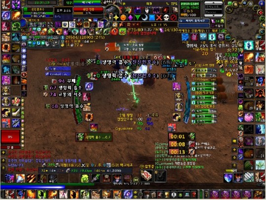
thedragonisaprincess: cockroachsoup:cockroachsoup: Aesthetic: MMO screenshots where the IU is... [feedly]


----
thedragonisaprincess: cockroachsoup:cockroachsoup: Aesthetic: MMO screenshots where the IU is...
// (ノ◥▶◀◤)ノ*:・゚✧

thedragonisaprincess:

cockroachsoup:

cockroachsoup:

Aesthetic: MMO screenshots where the IU is ridiculously cluttered and takes up most of the screen

image
image
image
image

These make me want to scream tbh


----

Shared via my feedly reader


Sent from my iPad

New Paintings on the Streets of Tokyo, Hong Kong, and Seoul by Pejac [feedly]


----
New Paintings on the Streets of Tokyo, Hong Kong, and Seoul by Pejac
// Colossal

pejac-1

Spanish street artist Pejac Pejac (previously) recently toured Asia with stops in Hong Kong, Seoul, and Tokyo where he created a number of murals and temporary installations that incorporate cultural references meant both as praise and critique. You can see several additional pieces posted on his website. (via Street Art Utopia)

pejac-2

pejac-3

pejac-4

pejac-5

pejac-6

pejac-7

pejac-8


----

Shared via my feedly reader


Sent from my iPad

Friday, July 3, 2015

http://www.scientificamerican.com/podcast/episode/color-you-remember-seeing-isn-t-what-you-saw/

http://www.scientificamerican.com/podcast/episode/color-you-remember-seeing-isn-t-what-you-saw/

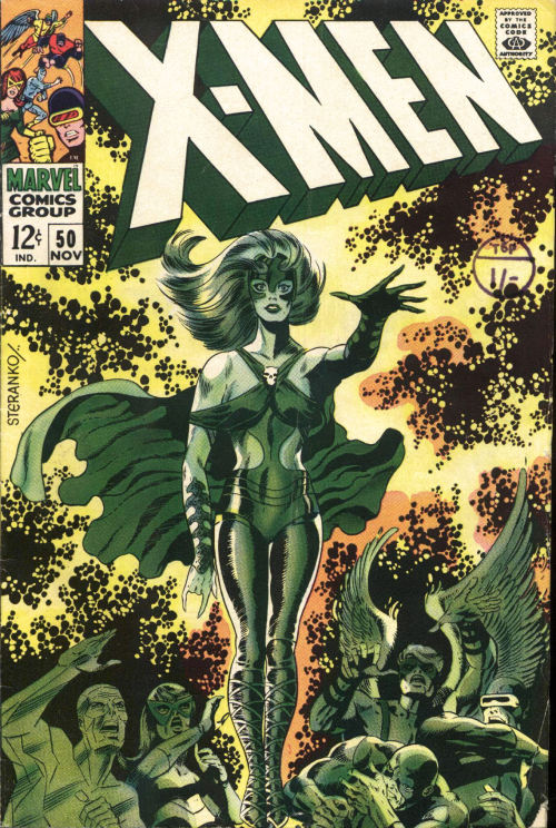
1407-graymalkin-lane: X-Men #50, ““City of Mutants” November... [feedly]


----
1407-graymalkin-lane: X-Men #50, ""City of Mutants" November...
// Hyperwave


1407-graymalkin-lane:

X-Men #50, ""City of Mutants" November 1968
Written by Arnold Drake. Art by Jim Steranko

Keep reading


----

Shared via my feedly reader


Sent from my iPad

explore-blog: Homer’s Iliad and Odyssey, adapted for kids in... [feedly]


Sent from my iPad

Paul Alexander - The very slow time machine, 1979. [feedly]


----
Paul Alexander - The very slow time machine, 1979.
// Hyperwave


Paul Alexander - The very slow time machine, 1979.


----

Shared via my feedly reader


Sent from my iPad

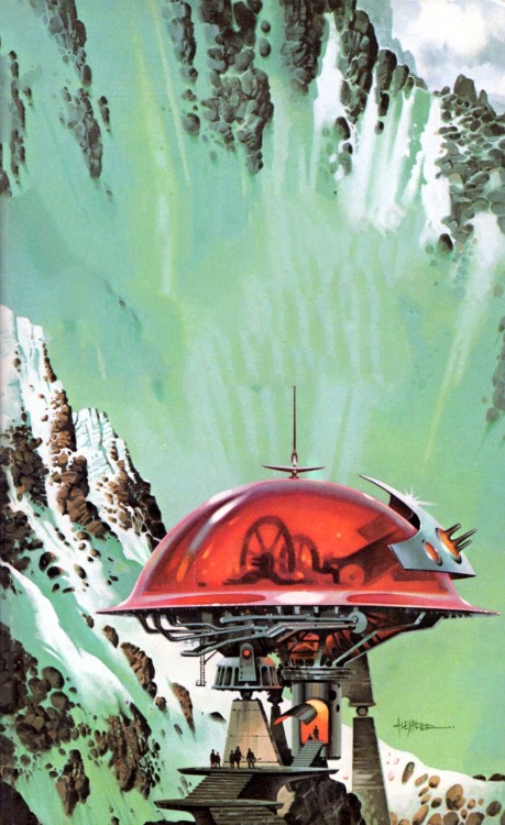
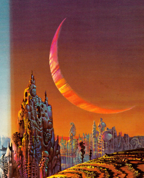
interplanetaryconnections: Bruce Pennington [feedly]


Sent from my iPad

gameraboy: Star Trek #24 (1974), cover by George Wilson [feedly]


----
gameraboy: Star Trek #24 (1974), cover by George Wilson
// Hyperwave


gameraboy:

Star Trek #24 (1974), cover by George Wilson


----

Shared via my feedly reader


Sent from my iPad

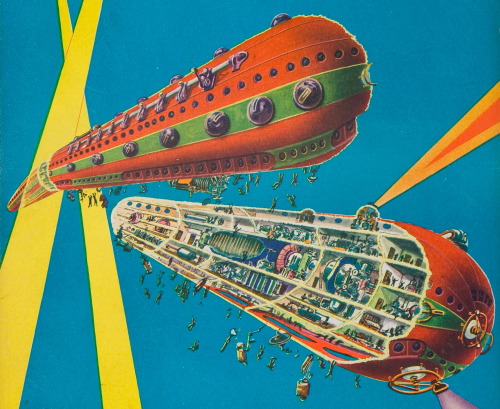
magictransistor: Frank R. Paul. Amazing Air Stories. 1929. [feedly]


----
magictransistor: Frank R. Paul. Amazing Air Stories. 1929.
// Hyperwave


magictransistor:

Frank R. Paul. Amazing Air Stories. 1929.


----

Shared via my feedly reader


Sent from my iPad

Kazumasa Uchio [feedly]


----
Kazumasa Uchio
// lines and colors

Kazumasa Uchio
Kazumasa Uchio is a Japanese concept artist and fantasy illustrator. Beyond that, I have little background information.

Uchio creates fascinatingly elaborate fantastic landscapes — full of curvilinear Art Nouveau inspired designs, glowing windows, luminescent plants and lots of other deliberate eye candy — inviting you to browse through them in a leisurely manner, as though a tourist, drifting through one of his fantasy worlds on a flying ship.

There are some fairly large images of his work that facilitate viewing his detailed approach on what I believe to be his official blog.

Unfortunately, the navigation is a bit awkward for those of us who don't speak Japanese. Look for the sequence of yellow numbered links just under the main banner image, or at the bottom of each page, to browse back through posts in order. Browsing this way, you may need to be patient and persistent to get to some of the most interesting images.

Alternately, click on some of the links in the third section of the right hand column, which are categories. You can also try Google Translate.

You can also search Flickr, or search Google Images, or get a brief overview on this Russian blog post. (Those of you with accounts on Pinterest, Tumblr or Pixiv can also try there. I don't link to sites that require membership to view the images.)

http://blog.ucchieys.com


----

Shared via my feedly reader


Sent from my iPad

It's Nice That : Minimalist architecture replicated in paper by photographer Nina Band [feedly]


----
It's Nice That : Minimalist architecture replicated in paper by photographer Nina Band
http://www.itsnicethat.com/articles/nina-band
----
Shared via my feedly reader


Sent from my iPad

Pastel Pick of the Week | Jennifer L. Hoffman Paints the Wonder of Nature [feedly]


----
Pastel Pick of the Week | Jennifer L. Hoffman Paints the Wonder of Nature
// Artist's Network

In a new solo exhibition entitled "Wonderment," Wyoming artist Jennifer L. Hoffman paints the unique beauty of the natural world in the beautiful valley around Jackson Hole, where she has lived for 20 years. "I think 'Wonderment' kind of summarizes my experience of becoming part of this very special community," says Hoffman.  "I have never stopped feeling a sense of wonder since I arrived."

Hoffman-DoeEyed_12x24_pastel

Doe-Eyed (pastel, 12×24) by Jennifer L. Hoffman

Hoffman's latest exhibition follows a time of creative exploration. "A friend recently reminded me of the importance of play in our work," she explains. As a result, Hoffman has been enjoying an experimental phase. "I've been playing with oil and cold wax on various supports, playing with the surface of the paint, applying it with rollers, palette knives, and house painting brushes," she says. "I've been using pastels on interfacing fabric and on homemade surfaces."

Hoffman has also included more wildlife in her current work than has been typical for the landscape painter. "My focus in this work has been to capture the momentary wonders that delight me, which is not really a new direction for my work," she says. "But recognizing how much I'm delighted by the birds in my backyard, by the deer who frequent my garden, by the diverse wild things that surround us here, I'm enjoying my attempts to capture my wild neighbors in paint and pastel."

The artist will be donating a portion of her exhibition sales to the Meg and Bert Raynes Wildlife Fund in support of Nature Mapping. She explains, "The underlying idea behind my show is that, with careful observation of what is around us, there are moments of pure wonder and awe to be experienced in our own backyards, in our own hometowns. Being in touch with our immediate environment is our link into both a much smaller and a much larger, more encompassing world.  I feel like what I'm doing as an artist and what the Nature Mapping project is doing are two sides of the same coin: Encouraging people to be fully present in their own corner of the world, to make a record, to take notice. I believe that art and science can work arm in arm to elicit the value of wild things of all sorts."

What: Wonderment—New Works by Jennifer L. Hoffman

Where: Trio Fine Art in Jackson Hole, Wyo.

When: July 8 – 25, 2015

Opening Reception: Thursday, July 23rd, from 5-8 pm

For more information: Visit Trio Fine Art


You'll find a full-length feature about artist Jennifer L. Hoffman in the February 2012 issue of Pastel Journal available for download here.


MORE RESOURCES FOR ARTISTS

richard mckinley landscapes book spring 201510.04.36 AMThe Art of Richard McKinley Deluxe features his new book, The Landscape Paintings of Richard McKinley, a 208-page, hardcover collection of inspiring works in pastel and oil. Plus, you'll get an 18-piece set of Great American pastels, UART paper, two DVDs with the artist, and a Richard McKinley eBook‚ all for $119. Limited time offer!

Watch pastel art workshops on demand at ArtistsNetwork.TV

Get unlimited access to over 100 art instruction ebooks

Online seminars for fine artists

Find pastel painting downloads, books, videos and more

Sign up for your Artists Network email newsletter and receive a FREE download

The post Pastel Pick of the Week | Jennifer L. Hoffman Paints the Wonder of Nature appeared first on Artist's Network.


----

Shared via my feedly reader


Sent from my iPad

Sargent's Portraits of Artists and Friends [feedly]


----
Sargent's Portraits of Artists and Friends
// Gurney Journey

John Singer Sargent, Ambrogio Raffele, 1904
An exhibition of John Singer Sargent's portraits of artists friends has opened at the Metropolitan Museum in New York, and will be on view through October 4.
-----
Sargent: Portraits of Artists and Friends

----

Shared via my feedly reader


Sent from my iPad

Paleolithic Milk-Based Paint Discovered [feedly]


----
Paleolithic Milk-Based Paint Discovered
// Archaeological Headlines - Archaeology Magazine

SIBUDU CAVE, SOUTH AFRICA—Researchers studying residue on a stone tool found in South Africa's Sibudu Cave have discovered a powdered paint mixture made of milk and ochre that dates to 49,000 years ago. While ochre was being used in what is now South Africa as early as early as 125,000 years ago to produce paint powder, this is the first time milk proteins have been identified in an ochre-based paint. The milk likely came from a bovid such as a buffalo or impala, and the paint might have been used for body decoration or to adorn a stone or wooden object. "Although the use of the paint still remains uncertain, this surprising find establishes the use of milk with ochre well before the introduction of domestic cattle in South Africa," University of Colorado Museum of Natural History curator Paola Villa said in a press release. "Obtaining milk from a lactating wild bovid also suggests that the people may have attributed a special significance and value to that product." To read more about the prehistoric use of ochre, go to "Stone Age Art Supplies."
----

Shared via my feedly reader


Sent from my iPad

Tweet by Imaginary Cities on Twitter

Imaginary Cities (@Oniropolis)
Lampitt & Pudney's ideal city (Illustrated Magazine, 1951) pic.twitter.com/gWRue2SzNW

Download the Twitter app


Sent from my iPhone