Sunday, June 7, 2015

Eye Candy for Today: Schetky’s Battle of Trafalgar [feedly]


----
Eye Candy for Today: Schetky's Battle of Trafalgar
// lines and colors

The Battle of Tragalgar, John Christian Schetky

Link is to Google Art Project, downloadable file on Wikimedia Commons, original is in the Yale Center for British Art.

My apologies to those of you who have had difficulty accessing Lines and Colors in the last week or so, particularly in the last few days.

The site has apparently been under attack by a particularly persistent bot, resulting in what amounted to a denial of service attack — overloading the web server and even preventing me from accessing the administrative panel for several days.

I've finally been able to take steps to counteract that, and hopefully prevent similar occurrences in the future.


----

Shared via my feedly reader


Sent from my iPad

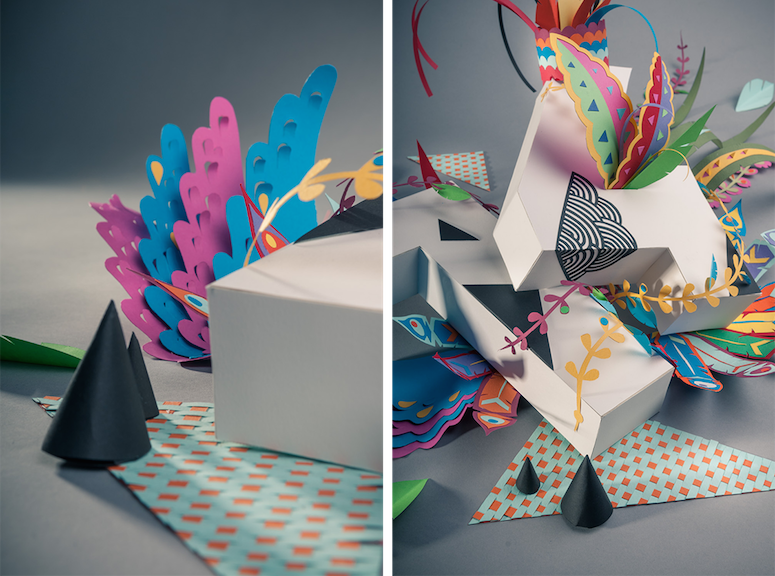
Look lively! German illustrator Sebastian Schwamm will light up your eyeballs [feedly]


----
Look lively! German illustrator Sebastian Schwamm will light up your eyeballs
// It's Nice That

Sebastian-schwamm-itsnicethat-list

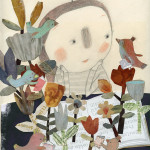
Many of us spend our lives bemoaning our unfortunate surnames (who, me?) but Sebastian Schwamm, whose family name is German for "sponge," is embracing his with admirable zest. "That's how I roll!" he says on his website, "absorbing anything that life throws at me and wringing it out on the paper."

Read more

Advertise here via BSA


----

Shared via my feedly reader


Sent from my iPad

retrogasm: The Abyss, 1917. Russian science fiction movie... [feedly]


----
retrogasm: The Abyss, 1917. Russian science fiction movie...
// space in text


retrogasm:

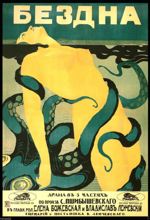
The Abyss, 1917. Russian science fiction movie poster.


----

Shared via my feedly reader


Sent from my iPad

Line Coloring Styles by Kawiku [feedly]


Sent from my iPad

You Paint Them By Not Painting Them? [feedly]


----
You Paint Them By Not Painting Them?
// Artist Daily

To Be Where There's Life by Ryan Coleman, oil on canvas, 30 x 40, 2010.

The coolest thing I ever learned about painting flowers, specifically how to paint a rose, was when a painting teacher told me that you paint them by not painting them. Back then I gave her the stink eye because, really, how do I paint a rose by not painting it? Ah, humility. How you love to teach me lessons. I soooo get what my instructor was saying to me now-—and it is one of the truest art lessons I've ever learned.

Painted flowers, plants, and other organic forms seem all the more real when they are painted less literally—when you work to capture the sensation of an object but not necessarily every petal, leaf, and thorn. For example, a vase of flowers could be painted with an eye toward capturing the strong thrusting lines of the stems or the light airiness of a flower in full bloom. And that has nothing to do with the exact number of petals you paint!

Memorial by Ryan Coleman, oil on canvas, 48 x 48, 2011.
Dark Fall by Ryan Coleman, oil on canvas, 48 x 48, 2007.
Memorial by Ryan Coleman,
oil on canvas, 48 x 48, 2011.

Dark Fall by Ryan Coleman,
oil on canvas, 48 x 48, 2007.

Sometimes the best way to achieve these kinds of effects is with a combination of representation and abstraction. Recently, I saw artist Ryan Coleman's work and his "floral paintings"—if you can call them such—do just that. The works are not literal depictions of flowers or bouquets or groves of trees, and yet when you look at them you somehow know what they are.

Many artists throughout the centuries have incorporated both representation and abstraction in their work, from El Greco, Corot, and Pissarro to Cezanne and Picasso. In the same way, Coleman strives to depict subjects and narratives without becoming too literal, which he finds restrictive. He strikes a balance between the two, so that he feels he can work freely and expressively while the end results are paintings and drawings with hints of representation that can be very reassuring and grounding to viewers.    

Season of Light by Ryan Coleman, oil on canvas, 30 x 40, 2011. Dream of Vermeer by Ryan Coleman, oil on canvas, 38 x 48, 2011.
Season of Light by Ryan Coleman,
oil on canvas, 30 x 40, 2011.
Dream of Vermeer by Ryan Coleman,
oil on canvas, 38 x 48, 2011.

One of the best ways to inject your painting with sensation and liveliness that can come with combining abstraction and representation is to work from a variety of inspirations or sources. Coleman usually has an assortment of images around him when developing any given painting, from images of nature and landscapes to those from art history, interior design magazines, graffiti, cartoons, or whatever else catches his interest.

Your art would also be well served by looking at all the variety of floral paintings out there and the levels of abstraction and representation they use so you have a strong understanding of where this subject matter can take you. Debora Stewart's Abstract Art Value Pack is a perfect place to start. It covers how to achieve dynamic forms in painting, ways to experiment, strategies for gesture, color, and more. Enjoy!  


----

Shared via my feedly reader


Sent from my iPad

Friday, June 5, 2015

Colley Whisson (update) [feedly]


----
Colley Whisson (update)
// lines and colors

Colley Whisson
Last year, I wrote about a series of YouTube painting demos by Austrailian painter Colley Whisson, who I first featured in 2011.

I thought it would be nice to more directly highlight some of Whisson's work, which is notable not only for his fresh, crisp, painterly technique, but for the remarkable energy and economy with which he presents his subjects.

I also find his approach to values fascinating. While some painters compress their values into a limited range — which is a common way to produce a kind of value harmony — Whisson seems to be unabashed about going from darkest darks to lightest lights in his compositions, and making it work beautifully.

In the hands of lesser painters, this can lead to awkward value relationships, but Whisson takes it on with apparent ease. I'm not certain I'm right in my analysis, but it looks to me as though he is compressing his value ranges in a different way, still using a limited range, but grouping them at the two ends of the value scale, leaving out some intermediate values to create a different kind of harmony.

He also makes keen use of value masses, arranging his compositions with large, forcefully geometric shapes, within which are nuanced variations of color. All of this is wrapped in a marvelously textural application of paint, in which the brush marks themselves are often pronounced geometric forms.

As much as I enjoy his bold landscape and cityscape scenes, I find a particular magic in his interiors, where his fascination with patterns of light and shade plays out at a smaller scale.

Whisson regularly conducts workshops, and his schedule this year brings him here to the US, though many venues have been booked up already.

Colley Whisson's work will be on view in a solo exhibition at the Brisbane Modern Art Gallery from June 9 to June 23, 2015

The gallery has a selection of images of Whisson's work, in which you can see the surface character of his work better than in the somewhat small ones on his website. I've linked to other galleries in which he is represented below.


----

Shared via my feedly reader


Sent from my iPad

Sunday, May 17, 2015

H. Septimus Power's Horse Paintings [feedly]


----
H. Septimus Power's Horse Paintings
// Gurney Journey

Septimus Power, The End of the Day
H. Septimus Power (1877-1951) was a New-Zealand-born Australian artist who was always fascinated with horses.

H. Septimus Power, Horse Cart, Watercolor
He got an early job painting animal heads on butchers' delivery vans, and later worked for a veterinarian. 


He studied at the Académie Julian in Paris and then moved to London, exhibiting at the Royal Academy. Arthur Streeton said of him: "One is impressed first by a tremendous display of colour and a dauntless feeling of optimism … He displays remarkable knowledge and vigour in his paintings of animals."

H. Septimus Power, Bringing Up the Guns
In World War I he worked as a war artist, specializing in scenes with horses. The biplane is almost a ghost in the distance.
----

----

Shared via my feedly reader


Sent from my iPad

Jakob Rebelka [feedly]


----
Jakob Rebelka
// lines and colors

Jakob Rebelka
Jakob Rebelka is a Polish comics artist, illustrator and concept artist for the gaming industry.

His interestingly different style combines areas of complex, intertwined forms with more open spaces and applications of texture. Often he will create the sensation of forms within forms by defining surface areas with lightly applied shadows and highlights, in a sort of bas-relief against the surrounding form.

His comics work includes the new graphic novel Le Cité Des Chiens ("City of Dogs", link is to Amazon.fr) with writer Yohan Radomski.

In addition to his Tumblr blog, you can find his work on ArtStation. Many of Rebelka's images are available as prints through inPrint and society6.

[Via Concept Art World]


----

Shared via my feedly reader


Sent from my iPad
Room in New York, Edward Hopper [feedly]


Sent from my iPad

Photo [feedly]


----
Photo
// Hyperwave


----

Shared via my feedly reader


Sent from my iPad

Thursday, May 14, 2015

Eclectic Paper Landscapes by Ink Studio Celebrate 2015 [feedly]


----
Eclectic Paper Landscapes by Ink Studio Celebrate 2015
// Brown Paper Bag

Ink Studio

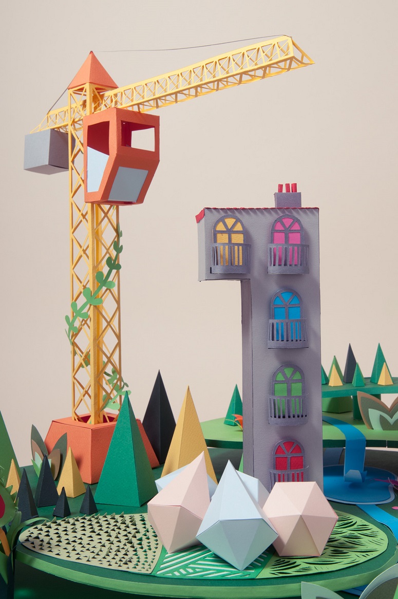
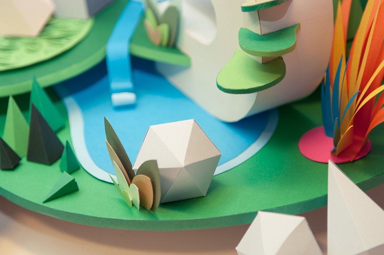
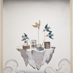
So it's not exactly the new year, but there's still plenty of time to enjoy this cut paper piece by Ink Studio. Look closely, and you'll see that this colorful landscape spells out "15" (as in 2015). It's part of their yearly paper design project.

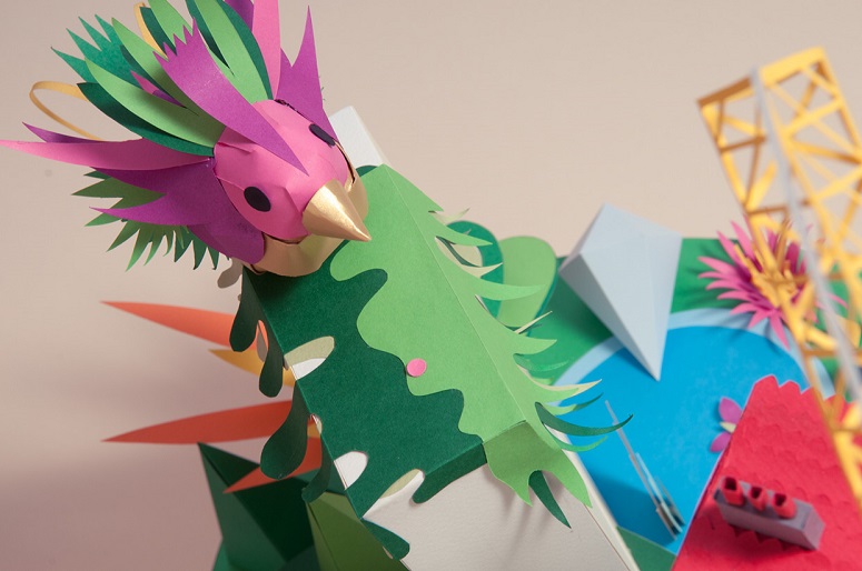
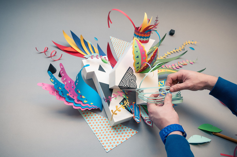
This hand-crafted piece utilizes a variety of textures and construction techniques. It was made by several people, and the eclectic style is reflected in the different-looking low-poly and X-acto cut outs. My favorite part is the bird with its pink and green plumage.

Ink StudioInk Studio ink-studio-5 ink-studio-7 ink-studio-3 ink-studio-1

Here's their 2014 creation:

ink-studio-16 ink-studio-17 ink-studio-18

The post Eclectic Paper Landscapes by Ink Studio Celebrate 2015 appeared first on Brown Paper Bag.


----

Shared via my feedly reader


Sent from my iPad

Friday, May 8, 2015

peder mørk mønsted's travels | One1more2time3's Weblog on WordPress.com

peder mørk mønsted’s travels | One1more2time3's Weblog on WordPress.com

this time I am posting some of PEDER MORK MONSTED'S paintings created during his frequent travels to switzerland and italy. born in 1859 in eastern denmark monsted had already studied with a landscape and portrait painter, before he moved at the age of 16 to copenhagen to attend the royal academy of art. in 1883…

https://one1more2time3.wordpress.com/2014/02/21/peder-mork-monsteds-travels/

Saturday, May 2, 2015

Ben Fenske [feedly]


----
Ben Fenske
// lines and colors

Ben Fenske
Originally from Minnesota, Ben Fenske now deivdes his time between Sag Harbor, NY and Florence, Italy. Fenske studied at the Russian Academy of Art, The Florence Academy of Art, the Studio of Joseph Paquet, Minnesota, and Bougie Studio, Minnesota.

Fenske paints still life, landscapes, interiors, portraits and figures with a fresh color palette, economical notation and painterly vigor — often with brushy scrubbing of color in areas that barely covers the support, at other times with a more refined and developed approach. In many cases, there is a appealing Van Gogh-like quality to his brusque, directional brush strokes.

Throughout his work is a keen sense of light and dark, often used to dramatic effect; even simple still life subjects take on a sense of visual drama. His seemingly casual paint application belies a nuanced approach to the use of texture — defining planes, revealing light and inviting you into his paintings with tactile presence.

In addition to his website, you can find an extensive selection of Fenske's work, at times with larger reproductions, on the site of the Grenning Gallery.

There is a brief plein air process video on Vimeo.

[Via Marc Dalessio and Leo Mancini-Hresko]


----

Shared via my feedly reader


Sent from my iPad

ooblium: Three paintings by Karel Thole [feedly]


----
ooblium: Three paintings by Karel Thole
// Hyperwave


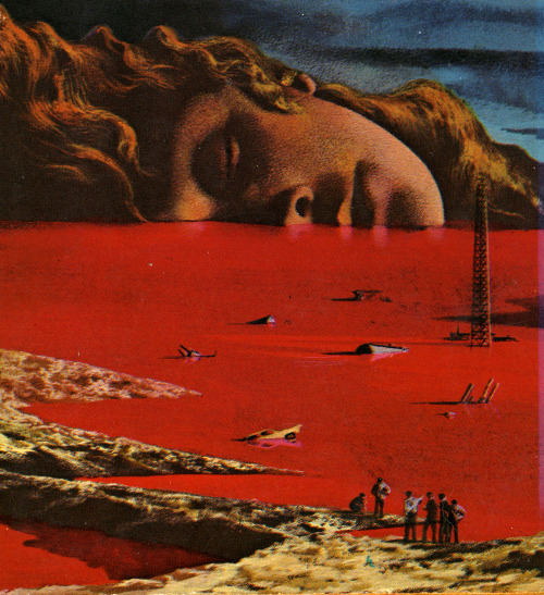
ooblium:

Three paintings by Karel Thole


----

Shared via my feedly reader


Sent from my iPad

Cecilia Beaux (update) [feedly]


----
Cecilia Beaux (update)
// lines and colors

Cecilia Beaux, 19th century American portrait painter
Cecilia Beaux — an American portrait painter active in the late 19th and early 20th centuries — is, like her contemporaries John Singer Sargent and William Merritt Chase, receiving something of a revival of appreciation for her place in the history American Art.

Unlike them, however, she still suffers from the fact that her contribution has rarely, if ever, been sufficiently acknowledged, largely because she was a woman.

Beaux was one of the best portrait painters of her time and, in my estimation, one of the finest American painters in history. Not only do I hold her in similar regard to painters like Chase and Thomas Eakins — who was one of her teachers — I can't help but think of her name as a fourth party whenever I hear the common grouping of the "Masters of the Loaded Brush": Sargent, Sorolla and Zorn.

Beaux was particularly adept in her portrayals of women, and was noted for her full-length and 3/4 length portraits in the "Grand Manner".

For more on my high opinion of Beaux as a painter, and why it deepened on seeing the extraordinary show of her work at the Pennsylvania Academy of the Fine Arts in 2008, I'll refer you to my 2008 post on Cecilia Beaux.

In this post, I'm taking advantage of the occasion of her birthday to display more examples of her work and point out some of the newer sources of images that have appeared on the web since my previous post. Unfortunately, they are still less than I would hope for a painter of her stature, and too few of them are large enough to appreciate her breathtaking command of the brush.

The image above, bottom, is one of her self-portraits.

There are a few books on Beaux, mostly out of print but available used from online sources:
Cecilia Beaux: American Figure Painter (2007)
Cecilia Beaux: A Modern Painter in the Gilded Age (2005)
Cecilia Beaux and the Art of Portraiture (1995)

The Cecilia Beaux Forum, named after the artist, is "a committee of the Portrait Society of America dedicated to the promotion of women in the arts".


----

Shared via my feedly reader


Sent from my iPad

Saturday, April 11, 2015

Eye Candy for Today: Adolph Menzel’s Balcony Room [feedly]


----
Eye Candy for Today: Adolph Menzel's Balcony Room
// lines and colors

The Balcony Room (Das Balkonzimmer), Adolph Menze
The Balcony Room (Das Balkonzimmer), Adolph Menzel

Link is to zoomable version on Google Art Project, downloadable file on Wikipedia, original is in the Staatliche Museum, Berlin.

In addition to Menzel's wonderfully casual, painterly brushwork, this piece is noted for its interesting composition, in which a large portion of the image is "empty".

To me, it's a fascinating series of contrasts: the full and empty of the composition, as well as the dark-within-light values of of the chair in front of the open French door contrasted with the light-within-dark of the reflection in the mirror against the dark wall — repeated in the dark rug against the lighter areas of the floor, and the patches of bright sunlight against the darker area of the floor.

Even the two lamps aside the mirror are opposite value contrasts. Whether intentional or not, the two chairs facing opposite directions seem to reinforce the idea of opposition.


----

Shared via my feedly reader


Sent from my iPad

Brian Robinson [feedly]


----
Brian Robinson
// lines and colors

Brian Robinson, watercolor landscapes and townscapes
After a successful career as a graphic designer, during which he painted when possible on the side, UK artist Brian Robinson transitioned into full time gallery art.

His crisply realized watercolor landscapes and townscapes glow with vibrant but naturalistic color, which derives its "punch" largely from Robinson's knowing placement of adjacent colors, rather than from artificially raised chroma.

His superb suggestion of textures, particularly evident in his woodland scenes and depictions of individual trees, gives his compositions an appealing sense of tactile immediacy.

Robinson's website divides his work into categories. You can find a few additional, slightly larger images on herts visual arts.

Robinson is represented by the Hawker Gallery, though their site doesn't include artist image galleries.


----

Shared via my feedly reader


Sent from my iPad

Sunday, April 5, 2015

3 Tips So You Don't Wipe Out on Smooth Washes [feedly]


----
3 Tips So You Don't Wipe Out on Smooth Washes
// Artist Daily

I am rolling my eyes with embarrassment when I tell you that when I first saw watercolor paintings with wide expanses of color I assumed that these were applied and then wiped out and smoothed over after they were laid down. I had no idea that there were watercolor painting techniques that you could use to get that effect with the stroke of the brush (and a lot of practice). Mea culpa--I'm a novice!

Kind of Blue by Amy Arntson, watercolor painting, 32 x 32.

But after I found that out, I did my watercolor art research and found several great tips for laying washes that are soft, diffuse, and flowing:

No stinginess. I'm always trying to hoard paint and that is a big mistake. To lay a wash, you've got to do it in one go, and to be on the safe side you should mix more pigment than you think you will need.

Spinner by Mary Whyte, watercolor painting, 2007.

Go off-kilter. Angling your watercolor painting surface forces a wash to flow downward and there won't be any drips. If you want to stop or reverse the direction that the paint flows, hold the surface so that you can quickly reverse the angle.

Don't turn back. This is the hardest one for me! You can't fix a wash by going back into it. In fact, usually it becomes more of a mess. Because of this, I keep scratch paper nearby to do a few practice strokes before I lay down the wash that I hope will be "the one."

If you want to see more incredible washes--plus luscious color and light effects--from expert watercolor artists with unique visions, Just Add Watercolor is just the thing. Enjoy!


----

Shared via my feedly reader


Sent from my iPad

Thursday, April 2, 2015

Gabriel von Max [feedly]


----
Gabriel von Max
// lines and colors

Gabriel von Max
Gabriel Cornelius von Max was a Czech/Austrian painter who was active in the late 19th and early 20 centuries.

Among his fascinations were parapsychology, mysticism and Asian philosophy, as well as anthropology and Darwinism. Likely from his interest in the latter, he kept a family of monkeys on his property, studied them and painted them, frequently in anthropomorphized activities like reading books.

The most famous of these works was his Monkeys as Judges of Art (images above, top, with detail).

Max was one of the early artists to work from photographs, undoubtedly a great help in capturing the appearance of his monkeys, who were unlikely to sit still for their portraits. Among his other subjects were religious, mystical or even medical themes.

There is a dedicated Gabriel von Max website, maintained by Jack Doulton, and two titles on Amazon: Gabriel von Max and Gabriel von Max: Malerstar, Darwinist, Spiritist (German Edition)

[Via Sterling Hundley]


----

Shared via my feedly reader


Sent from my iPad
magictransistor:Karel Thole (1914 – 2000) [feedly]


----
magictransistor:Karel Thole (1914 – 2000)
// Hyperwave


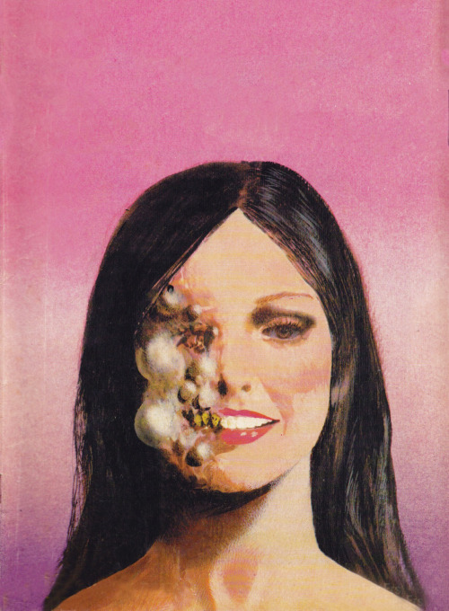
magictransistor:

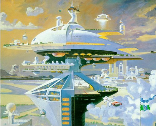
Karel Thole (1914 – 2000)


----

Shared via my feedly reader


Sent from my iPad