Wednesday, November 29, 2017
Links from Class 11/29/17
Albers on Brain Pickings
Interaction of Color
Albers and Color Constancy
Color Constancy Wikipedia
https://commons.wikimedia.org/wiki/File:ColourIllusion2.jpg#/media/File:ColourIllusion2.jpg
http://www.greenwoodindianapolispainterpainting.com/why-does-my-paint-look-lighter-on-the-wall-painters-advise/
Miro
Paul Klee
Piet Mondrian
Alexander Calder
German Expressionist
expressionism
Picasso at 15
Early Mondrian
Cubism
Big Magic
Remembering Design Legend Jonathan Selikoff
----
Remembering Design Legend Jonathan Selikoff
// Print Magazine
Print is incredibly saddened to learn of the passing of Jonathan Selikoff on Thanksgiving, 2017. He leaves behind his wife, Lauren, son Sam, and mother, Isabelle. Our deepest condolences are with his family.
Design Matters: Jonathan Selikoff
Having worked with everyone from Fortune 500 companies to stunning startups, the brand guru, writer and letterpress artist reflects on his career.
I first became aware of Jonathan Selikoff in 2003, via his cheekily intellectual writing for Armin Vit's then-upstart blog, Speak Up. The blog was a community of bawdy online design critics, some professional, some not, and the atmosphere on the site could be congenial, collaborative or fiercely combative, depending on the daily post. Even when he contributed to the rowdy banter, Selikoff was never one to throw a mean missive, and his writing was always constructive, thoughtful, deliberate, intellectual and clear. In short, he was one of the nice guys. Fast forward to the present, and Selikoff is still one of the nice guys. He left his eponymous agency in July after 15 years but still often does branding work, and he's also grown into a serious letterpress artist and an award-winning designer. While Selikoff has been challenged with a recent diagnosis of ALS, his spirit, optimism and wit are more potent than ever.
 How did you first find out about Speak Up, and what made you decide to join the online dialogue?
I must have been looking around for design stuff on the web and stumbled across it. I liked the quality of the commentary, the honesty in people's opinions. It seemed to be a real place to discuss design, and I wanted to be a part of that.
Back then you were working as a design director at Landor Associates in New York City. What was the general feeling toward branding in the blogging community?
If memory serves me, I think Speak Up supported the idea of branding, and that's part of what attracted me to it. It wasn't afraid to call out bad or lazy branding, but that wasn't an issue to me. Calling out unsuccessful projects, done in an educational manner, can serve as a guide for others.
Going back even further, you earned a bachelor's degree in history, yet your first job after graduating was at a branding and design firm. How did you manage that?
Well, my first job out of Emory was as a production guy at a reprographics shop in Atlanta. [Back in school], the more I worked on design at the college newspaper, the more I learned that graphic design was actually a career. So first I had a summer job at a newspaper, working in their paste-up room from 6 to midnight. Then I had an internship at Atlanta magazine. The art director, Matt Strelecki, had taught at Portfolio Center and really let me in on what graphic design was. After working for a year, I had a chance to interview for a design job. I showed my very meager portfolio and got a very meager response. Uncharacteristically for me, I said to the interviewer, "I gather you're not too impressed; what should I do?" He said, "Go to art school." Within a month I had quit my job and been accepted to Portfolio Center. Two years and a much better portfolio later, I had five interviews in one day in New York City and got a job.
You were at Landor for over five years. What were some of your proudest projects there?
1: Rebranding the International Rescue Committee. [I loved] the idea that you can make a profound difference in an organization that's not just a profit-making enterprise. 2: My very first project, rebranding a paper goods manufacturer called Fort James. What made my day was going into a bathroom at Yankee Stadium and seeing a Fort James paper towel dispenser with my logo on it. 3: Branding a telecommunication company in the U.S. Virgin Islands. Let's just say a business meeting in St. Croix wins any day over one in Dayton, OH! 4: Working out of the Hamburg, Germany, office for six months and redesigning the package for an old Austrian bottled water company to help bring them back to prominence.
![]()
You left Landor to start your own firm, Selikoff +Company, in 2002. On your website, you had a unique section I haven't run into elsewhere—rather than simply describing your qualifications, you posed rhetorical, yet all-too familiar problems, including the classic, "I need my customers to love my brand."
I put that together with my wife, who's a pretty good marketing specialist herself. I tended to get small companies inquiring about my services. They were often startups, or had just launched their first product, and she was instrumental in breaking it down to the client's level of understanding about branding. The inquiries I got were not, "Hey, we're launching a large brand with a conference in L.A. in three months and we need coordinated marketing collateral." It was, "I'm launching a product and I don't know what the next steps are," or, "I worked with another designer and I really don't like what they did." So it was really about reassuring them that branding was something they needed, and that I understood the end result was more than just a pretty package or a smart logo.
One of your most well-known projects is Reserve Life Organics. What was their biggest challenge, and how did you accomplish their goals?
The big challenge was the client called me before Christmas and said, "I'm launching a new line of resveratrol supplements into Vitamin Shoppe in January and I don't like what the last designer did." So, time and money. Typical. In my slow evolution of becoming a smart businessman, I made a deal. I said I'd do the initial design inexpensively, but here's what I typically charge and, if we continue, those will be the rates. She had an incredible backstory for the product, which just made my job so much easier. She didn't make her January launch, but she did in March and it took off . I worked with them over the next five years on retainer, launching five more brands for them and seeing them go into Whole Foods, GNC, Vitamin Shoppe and every natural product shop in the country.


You've said that you started your letterpress studio, Vote for Letterpress, because you had to. Why?
I had always loved letterpress, and graphic design was starting to wear on me. I was tired of being tethered to a computer all day. Typography is my absolute favorite aspect of design, and I had this amazing collection of wood type. I bought a small press in 2008 and learned a lot from it, but around early 2010 I wanted something bigger. I started looking and found an entire shop for sale. Most midlife crises involve Porsches. Mine was a letterpress shop. I had the passion and the ability (for the most part!), and I knew I had to just go for it.
Your love affair with letterpress began when you were a 12-year-old attending summer camp.
The camp I attended, Long Lake, in the Adirondacks, was an arts and music camp. I played trombone in their orchestra and played at other things, like making jewelry or running lights for a play. But the letterpress machines looked cool, so I wanted to try it. I also loved model rocketry, so I dabbled in a lot of stuff . But letterpress stuck with me, and when I got to Portfolio Center, it came bubbling back up.

You've collaborated with a fellow Speak Up author, illustrator Felix Sockwell. What did you work on?
I'm happy to print business cards and cool wedding invitations, but the best projects were with unique characters with unique projects. Felix and I had known each other since the Landor days, when I hired him for an awful client project. Fortunately, he didn't hold it against me. Over the years, we did many personal projects for him—posters of yoga icons, a Bruce Springsteen poster (another huge passion of mine) and a calendar for New York Public Radio. Felix has strong opinions, so we butt heads occasionally, but it usually leads to something better. I certainly appreciate that he knows what he wants. It's better than a client who says, "Yeah, do whatever, it'll be great." The NYPR calendar project was insane. Two thousand calendars—one black plate, one split fountain plate where I put three colors on press at once and let them blend. Each print becomes unique. It took three solid weeks of printing. I'd print, Felix would stack prints. But we got them done in time and the client loved it. I loved it. That's the passion part to me. I want to love what comes off the press.
You were recently diagnosed with ALS. How are you doing?
I was diagnosed in December 2015. Diagnosis took a year because there's no test that tells you you have ALS. Tests rule other things out, but it's not until you have sufficient progression that it's clear this is what you have. I'm managing as best as I can with it. I've lost my ability to speak. I'm very weak in my arms to the point that I can no longer use one of my presses. It's depressing because it's robbing me of something I love to do. On the other hand, I know of many ALS patients who've become completely paralyzed within a year of diagnosis. I'm still walking, able to drive myself places, pick my son up from camp. I treasure that.
How has your diagnosis influenced your perspective on life and design?
I'm sad that I don't have the stamina to take on large print projects. If something seems fun, I'll give it a shot. But I'm more interested in enjoying life and spending time with my family, whether that means going to Costa Rica to zip line and play with monkeys, or taking my son to five Springsteen concerts last year or watching him rock out at School of Rock camp. Spending time with my wife and son and my mom is what keeps me going.


The post Remembering Design Legend Jonathan Selikoff appeared first on Print Magazine.
----
Read in my feedly
Sent from my iPhone
A Study In Edges
----
A Study In Edges
// Artist Daily

Where Lines and Strokes Matter
Maybe you'll know the feeling I'm describing. The feeling when you are painting and you keep thinking, "What am I doing?" followed by the internal response to "keep going." Again and again it happens until that moment when you see your lines and strokes and colors turn into something? Then it turns into magic. Edges are like that too.
I hardly pay attention to edges as I create them. I see the lines and strokes I put down, but not the edges they result in. Not until they become part of what I'm painting and then, edges become a big part of the magic.
Daniel Gerhartz is a prize-winning artist and workshop instructor, and he has brought us some great info on squinting, and today he's coming to us with a lesson on the magic edges. Enjoy!


It Can Be About Edges
Often as I survey a model's appearance, I look for the one key visual aspect that initially catches my eye and make it the focus of my study. This can be an elusive, fleeting quality of light that lasts only moments or a lyrical rhythm of line.
In essence, all these characteristics are variations of line, harmony, tone, color, or edge. In Mr. Johnson, my focus was a study in edges as I strove to convey the power of the form and drama of the subject.
Find the Relationship
The key to painting edges accurately is to truthfully observe how they look in proper relation to each other and then paint that relationship. Before I set my brush to the canvas, I find it very important to take an assessment of the subject in terms of the extremes in value, color, and edges, and organize my thinking around these from the outset.
In this case, as edges were my focus, I squinted down at Mr. Johnson, and made a mental note of the hardest visible edges. These are circled in red.
Squint to See Hard and Soft
Why do I squint? If I don't, everything appears to have a sameness of edge. By gently closing my eyes about half way, the forms are simplified and the variety between hard and soft edges becomes more visibly evident.
You will notice in the circled areas that the edge quality is razor sharp in some spots. This is how they looked when I was squinting down! It is so important to paint these areas just as they appear: razor sharp!
See the difference between the sharp edge circled between his eyes and the edges of his brow line as the eye sockets rounded up into the forehead or the hard edge of the hat visor compared to the softer edges on the cast shadow on the forehead from the hat.
Neck Meet Chin
Another area of great edge contrast is on the area of the neck beneath the chin. Notice the extremely sharp edge between the neck and shirt compared to the softer edges of the cast shadow of the chin on the neck.
Also, an area that I often see painted too hard by students is the edge quality of the transition between the top plane and the bottom plane of the nose. Observe the very soft quality of this turning form.
Broad Brush
Early in my development, I admired many of the "broad brush" painters whose works I studied. I was seduced by the bold sweeping strokes they made as they rendered a head or figure.
But those "beauty strokes," as my friend Scott Christensen so aptly calls them, should not destroy the form or take away from the sensitivity with which you paint the subject. What I failed to notice was the painstaking attention to the accurate rendering of the form that was always beneath the bold surface quality of these artists.
Look for Sharpest
So the next time you have a subject before you, carefully assess the subject, squint down and let the sharpest edges emerge. When beginning a work, establish the sharpest edges as early as you can in the painting so that you can use them to compare against. This is critical!
As you progress, hold onto the sharpest edges as reference points and notice the how all of the other edge transitions relate to them in descending order. It is this great contrast that will give your work new dimension!
For more of an edge education, sign up for Paint Along: Landscape Painting, All About Edges. You'll find out how to capture a vast and lovely landscape on a two-dimensional surface with the correct manipulation of edges — and in this online workshop, master professional landscape artist, Johannes Vloothuis, will give you the keys to achieve this, and will reveal many other valuable landscape painting tips along the way. Enjoy!
The post A Study In Edges appeared first on ArtistDaily.
----
Read in my feedly
Sent from my iPhone
hideback: Joan Miró (Catalan Spanish, 1893 – 1983) The...
----
hideback: Joan Miró (Catalan Spanish, 1893 – 1983) The...
// The Curve in the Line
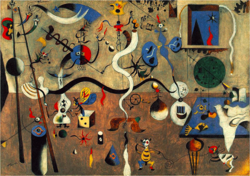
Joan Miró (Catalan Spanish, 1893 – 1983)
The Harlequin's Carnival, 1925
----
Read in my feedly
Sent from my iPhone
Colorful Culinary Portraits by Enora Lalet
----
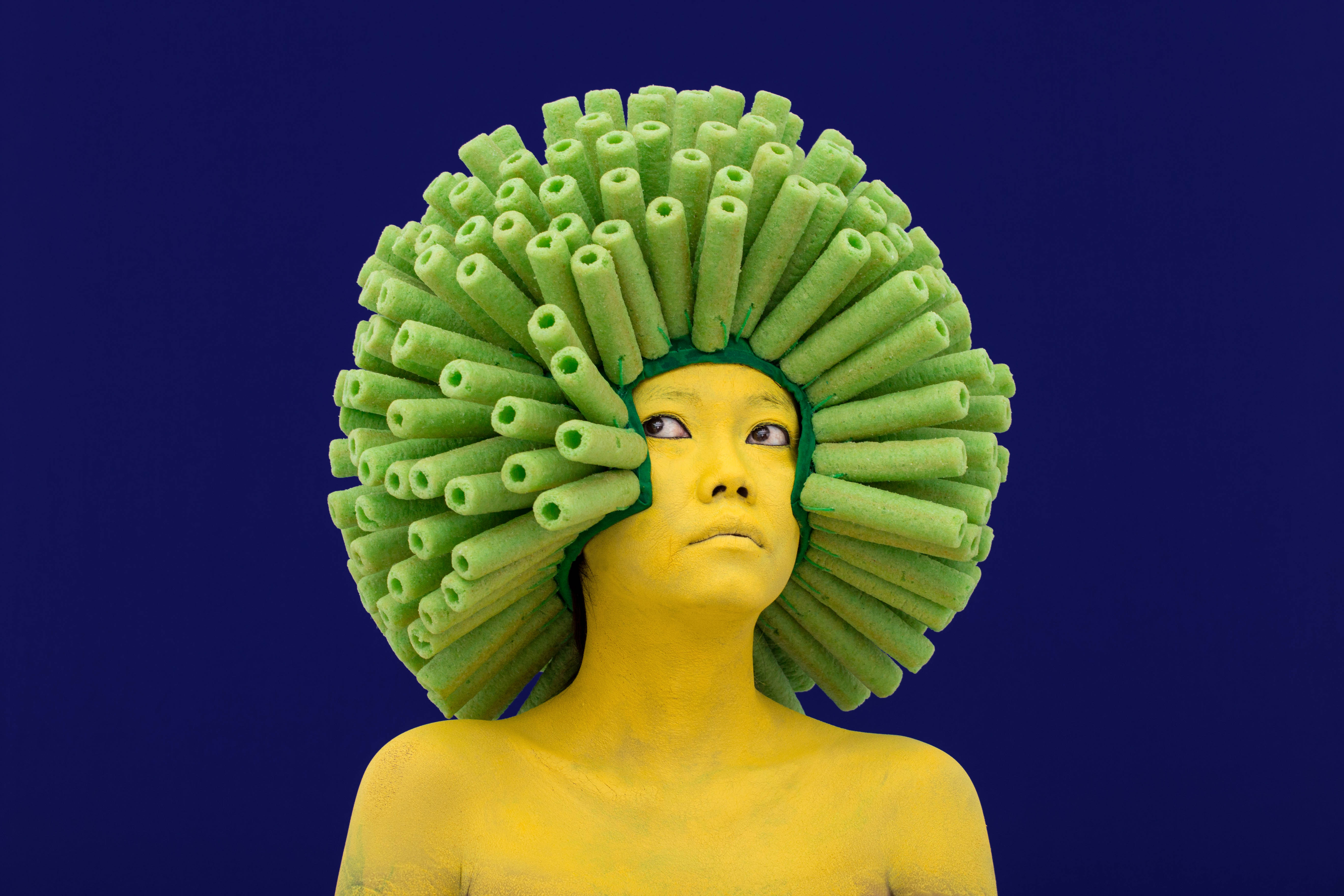
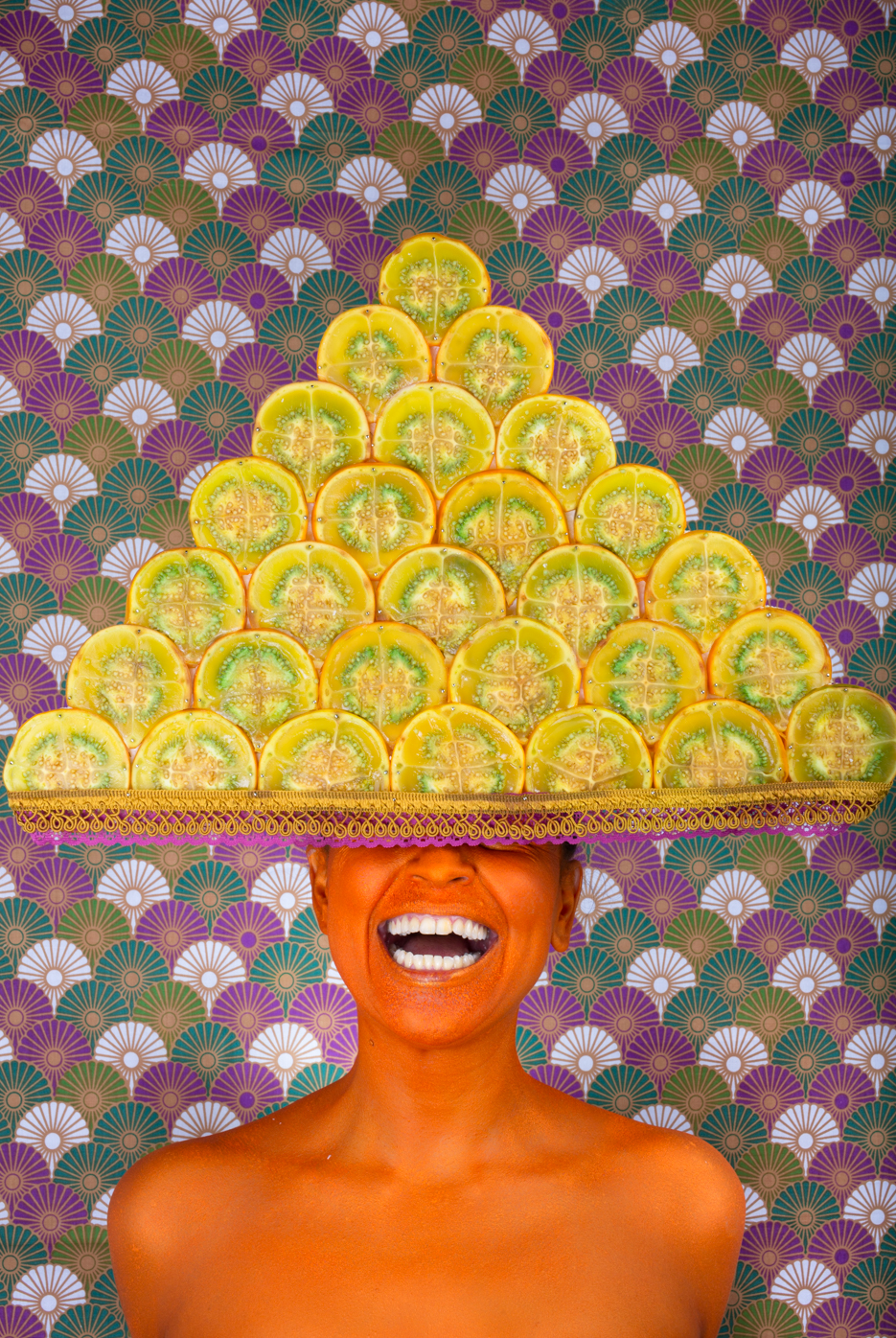
Colorful Culinary Portraits by Enora Lalet
// Fubiz
French visual artist Enora Lalet photographs food on the faces and hair of her models. She imagines crazy, colorful and appetizing scenes which make us grin and take inspiration from her various travels. Through her exquisite photographic series and the magic of body painting, culinary design, sewing, and live installation, she creates an almost anthropological work, highlighting the many cultures of the world. We'll start to find traditional cooking pictures boring now!
To discover her work, visit her website. 


----
Read in my feedly
Sent from my iPhone
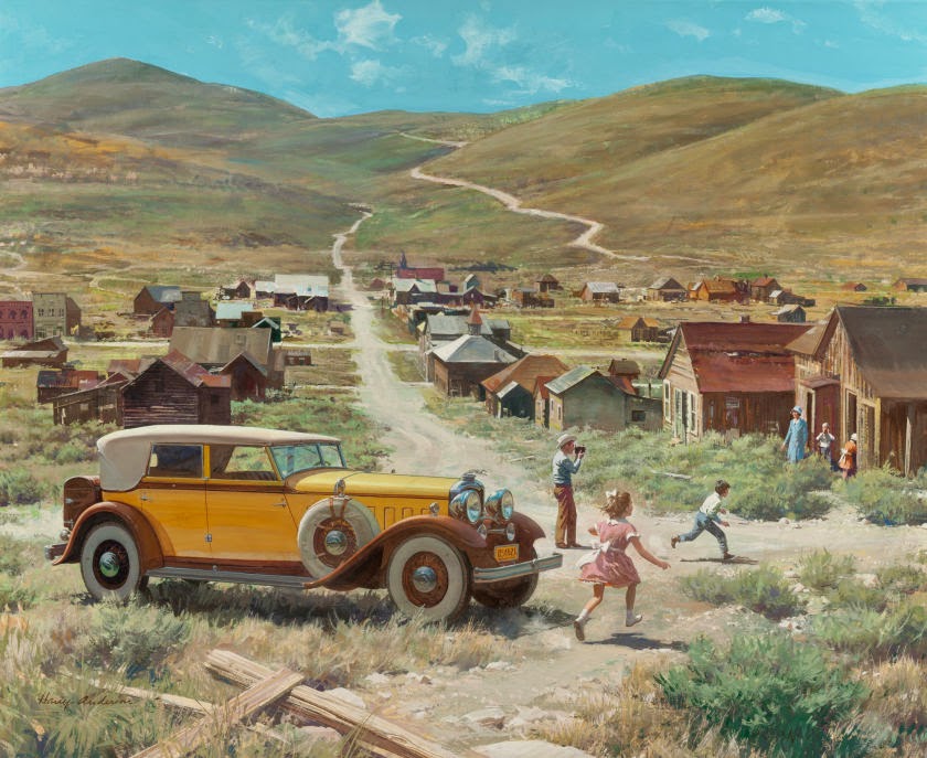
Harry Anderson book on its way
----
Harry Anderson book on its way
// Gurney Journey
The Art of Harry Anderson is the next in the lavish series of hardcover monographs from The Illustrated Press, the small company that previously produced the books on Tom Lovell, Jon Whitcomb, and Dean Cornwell.
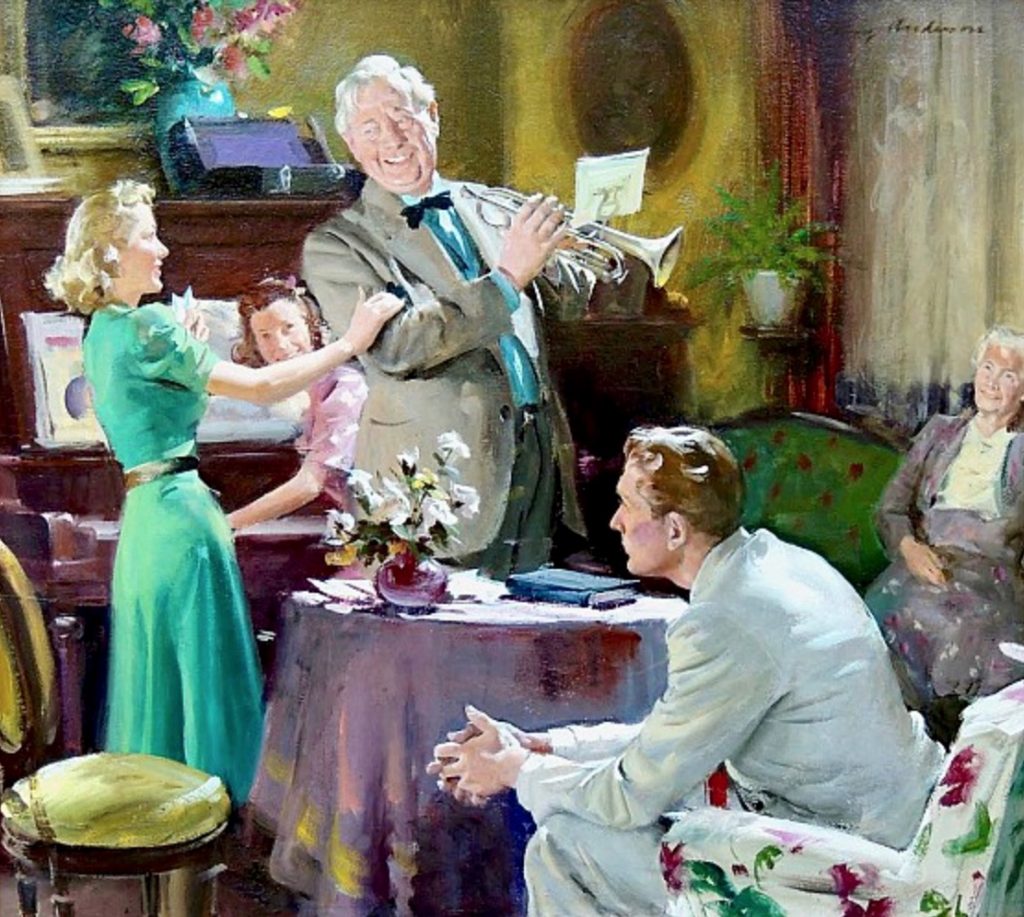
Born in 1906, Harry Anderson is best known as for his magazine illustrations of children and romantic situations, probably the hardest subjects to pull off successfully.
He was always a resourceful colorist. Look how the painting above is restricted almost entirely to blue-green, red-violet, and yellow ochre.
Although I haven't actually held the book in my hands yet, it will start off with a short biography, but the bulk of the pages will be devoted to big, beautiful color illustrations — 300 of them in the 224 page hardbound book. I wish all art books gave so much space to art.
There are representative examples from all the categories of art he was engaged in: editorial, advertising, calendar, religious, and gallery art.
There are representative examples from all the categories of art he was engaged in: editorial, advertising, calendar, religious, and gallery art.
Much of the art in the book is reproduced from originals, but some is printed from vintage tearsheets. I like seeing those too because it gives a sense of the graphic presentation in the magazine layouts, so characteristic of the time.

The standard edition is $44.95 USD, and there's also a special edition for $64.95 that comes in a custom slipcase and is limited to 100 copies. Both editions are hardbound, 12 x 9 inches.
 You'll never see these books at Barnes and Noble or a museum bookstore, because it just doesn't pay for small publishers like the Illustrated Press to deal with brick-and-mortar retail accounts or to warehouse an overly large printing. The earlier books, The Art of Jon Whitcomb and Tom Lovell—Illustrator books have sold out, and are only available on the secondary market at much higher prices. The Dean Cornwell book was brought back into print by popular demand and is still available.
You can preview the entire book online and preorder the book now at Illustrated Press. Shipping is expected to take place in March of 2018.
----
Read in my feedly
Sent from my iPhone
Karl J. Kuerner
----
Karl J. Kuerner
// lines and colors

I had the opportunity this fall to take advantage of a one of the Plein Air Painting Days sponsored by the Brandywine River Museum, that gives artists the opportunity to paint at Kuerner Farm in Chadds Ford, PA.
The farm is famous as the location for many of Andrew Wyeth's most recognizable works, and is now part of the Brandywine Conservancy. It's also simply a beautiful place to paint, with or without the connection to Wyeth.
While there, I happened to meet Karl J. Kuerner, an artist who works in the Brandywine tradition, and with whose work I was only passingly familiar. I had seen a few pieces online on a gallery's website, but not his own site.
Karl introduced himself, commented on my painting and then was nice enough to show me a book of some of his work, which I liked very much.
Kuerner is the grandson of the Kuerners who lived on the farm when young Andrew Wyeth started visiting and painting there, a practice Wyeth continued for most of his career.
Though the farm is now part of the Brandywine Conservancy, Kuener still visits regularly to tend to the goats, rescue animals that now live on the farm.
Karl J Kuerner grew up with an interest in art that was encouraged by Carolyn Wyeth, Andrew's sister and an artist in her own right, and was later mentored by Andrew Wyeth for over 30 years.
Though the influence of his teacher and mentor is evident in his approach, and he has access to much of the same subject matter, Kuerner has taken his own approach, expanding the range of what is generally known as the Brandywine tradition, a style of painting that stems from the great American illustrator Howard Pyle, through his students, including N.C. Wyeth, and passing down to Andrew and those influenced by him.
Part of the Brandywine tradition stems from the beauty of the area itself, which I took for granted when I was younger; but having traveled over the years, I still believe it's one of the most beautiful areas in the country. The bucolic rolling hills of the Appalachian piedmont that cuts diagonally through eastern Pennsylvania seem particularly charming in the Brandywine Valley. It's not surprising that the area has inspired generations of artists.
Kuerner has responded to the landscape with an approach that is perhaps more direct than that of his mentor, with brighter colors and an eye to strong compositional geometry — though still including an emphasis on the rich textures of trees, fields and the walls of farm buildings.
He also paints playful interpretations of animal subjects, seascapes, still life and some narrative compositions that have a feeling of illustrations for untold stories.
In addition to the images on Kuerner's website, there is a collection of his work, All in a Day's Work: from Heritage to Artist, available from Cedartree Books.
Also published by Cedartree are Kuerner's children's books, featuring a black cat: Ike at Night, Ike at Sea and Ike Takes Flight.
Kuerner sometimes conducts classes at the farm, organized through the Brandywine River Museum.
Karl J Kuerner's work will be on display at Mala Galleria in Kennet Square, PA, in a group show, "Our Brandywine Tradition" that opens this Friday, December 1st (opening 6:00 – 9:00 PM), and runs to December 28, 2017.
----
Read in my feedly
Sent from my iPhone
Two kinds of practice
----
Two kinds of practice
// Seth Godin's Blog on marketing, tribes and respect
The first is quite common. Learn to play the notes as written. Move asymptotically toward perfection. Practice your technique and your process to get yourself ever more skilled at doing it (whatever 'it' is) to spec. This is the practice of grand slalom, of arithmetic, of learning your lines or c++.
The other kind of practice is more valuable but far more rare. This is the practice of failure. Of trying on one point of view after another until you find one that works. Of creating original work that doesn't succeed until it does. Of writing, oration and higher-level math in search of an elusive outcome, even a truth, one that might not even be there.
We become original through practice.
We've seduced ourselves into believing that this sort of breakthrough springs fully formed, as Athena did from Zeus' head. Alas, that's a myth. What always happens (as you can discover by looking at the early work of anyone you admire), is that she practiced her way into it.
----
Read in my feedly
Sent from my iPhone
Colorful Renovation of a Barcelona Home
----
Colorful Renovation of a Barcelona Home
// Fubiz
Casa Horta, a three-storey 1920s structure in Barcelona, Spain, is the home of interior and product designer Guillermo Santomà. Overseeing the renovation himself, Santomà created a fantastic space painted in energetic shades of blue, green and pink, along with tasteful Spanish tilings on the floor, intricate motifs on the doors, and a ceiling painted with clouds.


----
Read in my feedly
Sent from my iPhone
Tuesday, November 28, 2017
Colorful Paper Foods and Patterns by Maud Vantours
----
Colorful Paper Foods and Patterns by Maud Vantours
// Colossal

Photography / Charlotte Ortholary @Figure.fr
Paper artist Maud Vantours brings paper to life through a wide variety of commercial and self-initiated projects that span 3D paper sculpture displays for top brands to editorial work for magazines and ad agencies. The French designer has also explored a more artistic realm with her organic Oscillations series. Vantours shares some of her most recent work on Instagram.

Photography / Charlotte Ortholary @Figure.fr

Photography / Charlotte Ortholary @Figure.fr

Photography / Charlotte Ortholary @Figure.fr


----
Read in my feedly
Sent from my iPhone
Subscribe to:
Posts (Atom)